Top financial data visualization tools to create automated multi-page reports
In the finance industry, report generation is a crucial aspect of operations. Manually creating these documents is time-consuming and error-prone. Automated reporting has emerged as a game-changer, improving the process and ensuring timely distribution of critical information to stakeholders.
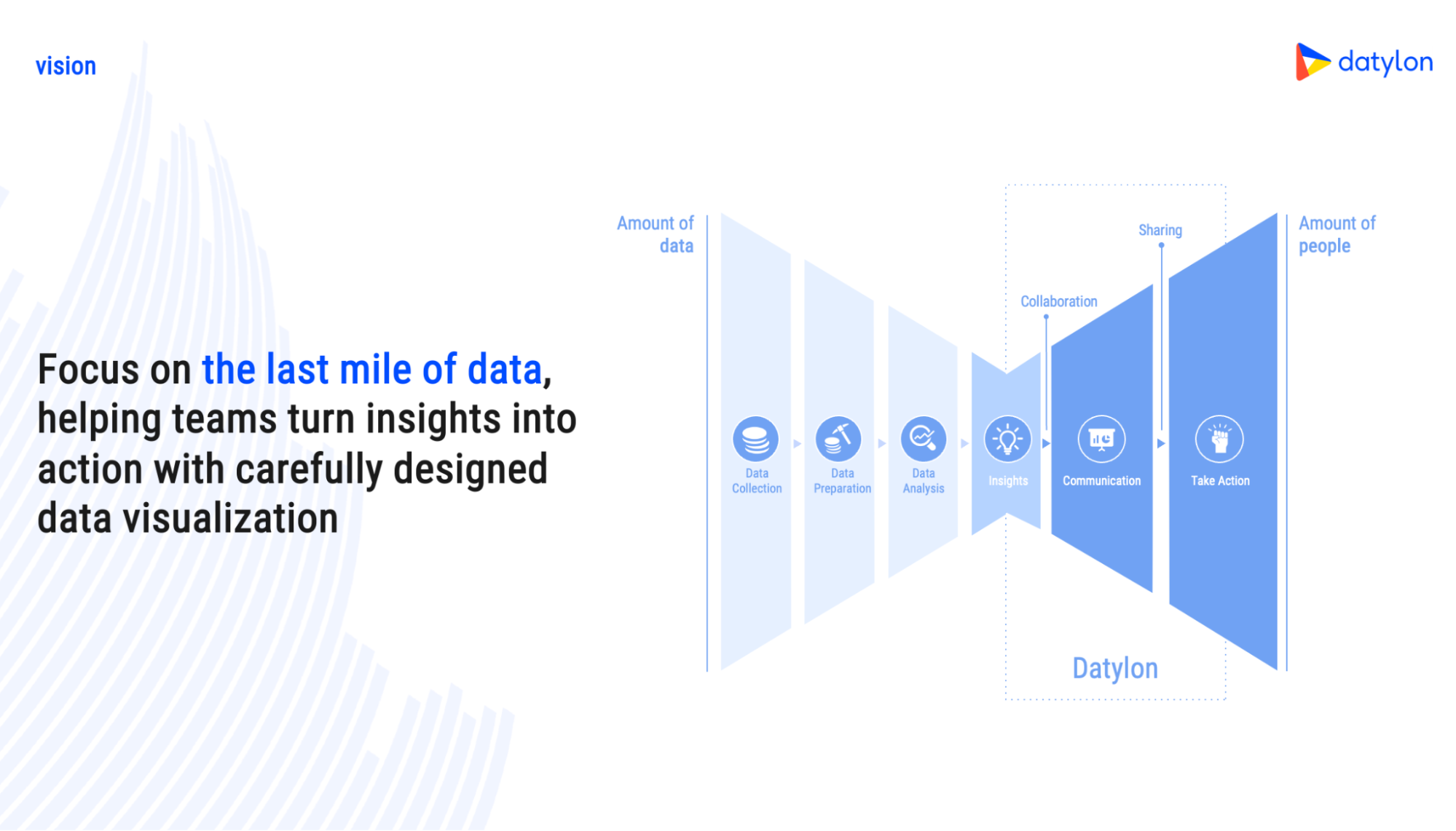
This guide focuses on the 'last mile' of data: helping teams turn insights into action with carefully designed reports. We won't delve into tools for dynamic dashboards but instead concentrate on tools that excel at automatically generating comprehensive, static reports.
With many automated reporting solutions available, selecting the right fit can be overwhelming. To help you in your decision-making process, we've created a detailed comparison of leading tools: Datylon Report Server, Tableau Server, Power BI Report Server, Qlik, Looker, JasperReports Server, Logi Report Server, and SQL Server Reporting Services (SSRS).
We'll assess these tools across key dimensions such as data integration, financial analysis capabilities, reporting features, financial chart options, customization flexibility, automation power, compliance with financial reporting standards, ease of use, and princing. By the end of this guide, you'll have a better understanding of which tool best aligns with your organization's needs.
Disclaimer
This article offers a snapshot overview of financial data visualization tools—Datylon Report Server, Tableau Server, Power BI Report Server, Qlik, Looker, JasperReports Server, Logi Report Server, and SQL Server Reporting Services (SSRS)—based on online information as of the research date of 30-01-2024. Given the dynamic nature of technology, updates may have occurred.
While efforts have been made for accuracy, view this as a starting point. Details reflect publicly available information and details, pricing, and features may change. Readers are urged to verify details from official tool sources for the latest information. Individual experiences vary, and tool suitability depends on organizational factors. Thorough research, trial versions, or demos are recommended for informed decisions.
Table of content
1. Assessing data integration and security 3. Creating insightful reports |
Assessing data integration and security
Let's begin by exploring one of the crucial aspects of creating a financial multi-page report: data integration and security. We will assess whether the tools explicitly address their possibility to connect to various data sources.
Moreover, in an era of increasing cyber threats, a tool's commitment to robust security measures becomes crucial for businesses relying on automated reports. Therefore, we'll show whether they mention the security standards, emphasizing their importance in safeguarding sensitive financial information.

As indicated in the table, this marks a positive beginning. Each tool mentions the capability to connect to diverse data sources, and all have implemented security measures to keep your data safe.
Financial analysis options
Another dimension of automated financial reporting involves financial analysis. While it may not be inherently necessary for reporting, having tools that provide both financial analysis and reporting capabilities can enhance efficiency.
In the following checkbox, you can find the tool's ability to perform complex financial calculations and financial formulas, ensuring the accuracy of financial metrics and KPIs. Additionally, you can find if the tools are capable of forecasting and budgeting, providing a comprehensive solution for financial planning and analysis. This evaluation helps you find the effectiveness of each tool in meeting your financial analysis requirements.
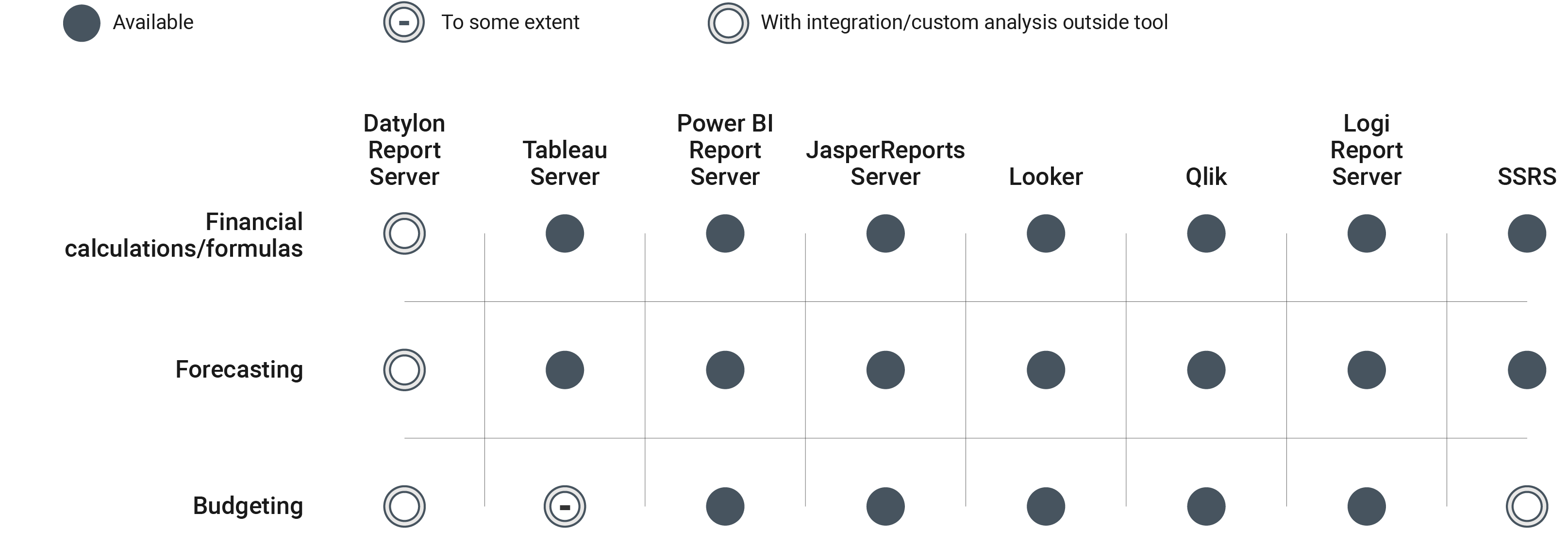
As shown in the table, most tools can handle basic financial calculations and formulas in addition to general data analysis. They also offer some features for financial forecasting and budgeting.
Datylon Server is a bit different. While it doesn't have built-in financial analysis functions in the tool, it is possible to request custom analysis functionalities. Alternatively, combine Datylon's reporting strengths with a dedicated analytics tool to create powerful, automated reports.
Creating insightful reports
Up to this point, the tools have exhibited a considerable degree of similarity. However, within this paragraph, we'll start to notice the initial differentiating factors among them.
In financial data visualization, the ability to generate comprehensive multi-page reports is crucial for effective communication. In this paragraph, we explore the tool's capabilities in creating detailed and insightful reports.
Our evaluation focuses on the ease of creating multi-page reports, a critical aspect for financial professionals seeking to present complex data in an engaging data story. We also assess the tools' suitability for incorporating extensive textual content and annotations, important components that contribute to the depth and clarity of multi-page reports.

As shown, some of the tools excel in creating multi-page reports enriched with extensive text and annotations, adding a narrative dimension to the presentation. These features play a crucial role in the storytelling process.
On the flip side, other tools prioritize the creation of dashboards, emphasizing a more focused approach to data visualization. These tools are less suitable for creating static multi-page financial reports.
Financial specific charts
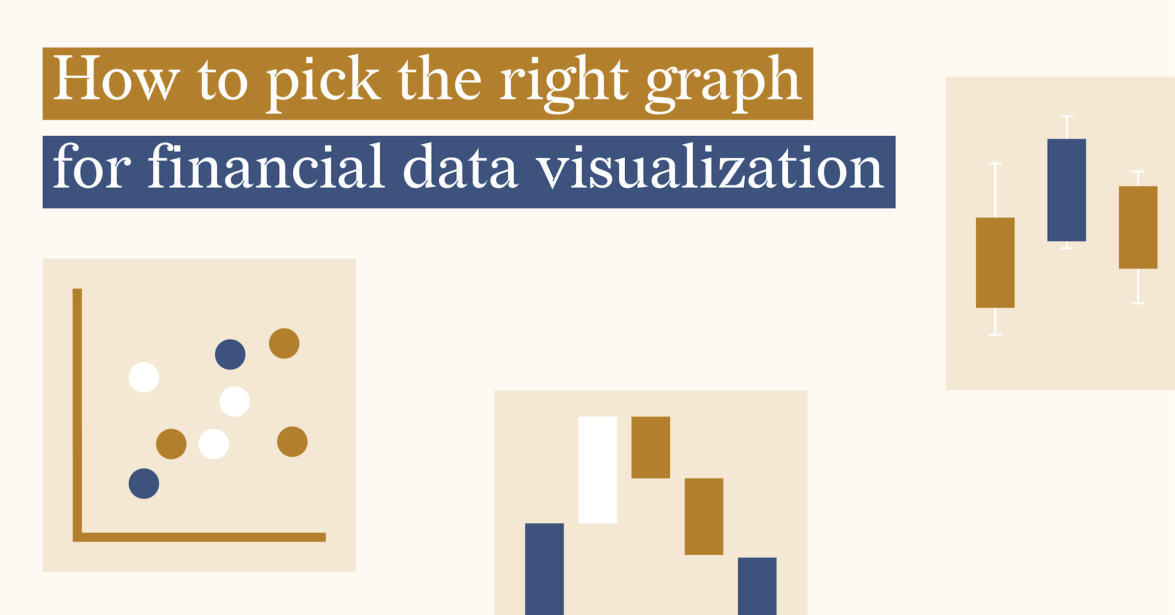
When it comes to financial data visualization tools designed for creating automated multi-page reports, the inclusion of specific charts tailored for the finance sector is crucial. These charts improve the clarity of data and provide insights into complex financial information. The tool's repertoire should ideally include a variety of financial-specific charts. Key among them are:
- Line Chart: Effectively tracks trends over time.
- Bar Chart: Perfect for comparing different financial metrics.
- Waterfall Chart: Provides a detailed representation of profit and loss, showing the incremental impact of various factors.
- Candlestick Chart: Originating from the world of technical analysis, it offers a comprehensive view of price movements in financial markets, providing insights into market sentiment.
- Boxplot or Dot Plot: These charts can help in identifying the distribution of the data and for statistical measures such as the median, outliers, and quartiles (box plot), contributing to a more comprehensive financial analysis.
With these financial charts in their toolkit, automated reporting tools become a secret weapon for creating engaging, easy-to-understand reports.
All the tools mentioned in this article offer the charts mentioned above in some capacity. The table below outlines the availability of each chart type in these tools, either as a default feature or through a workaround.
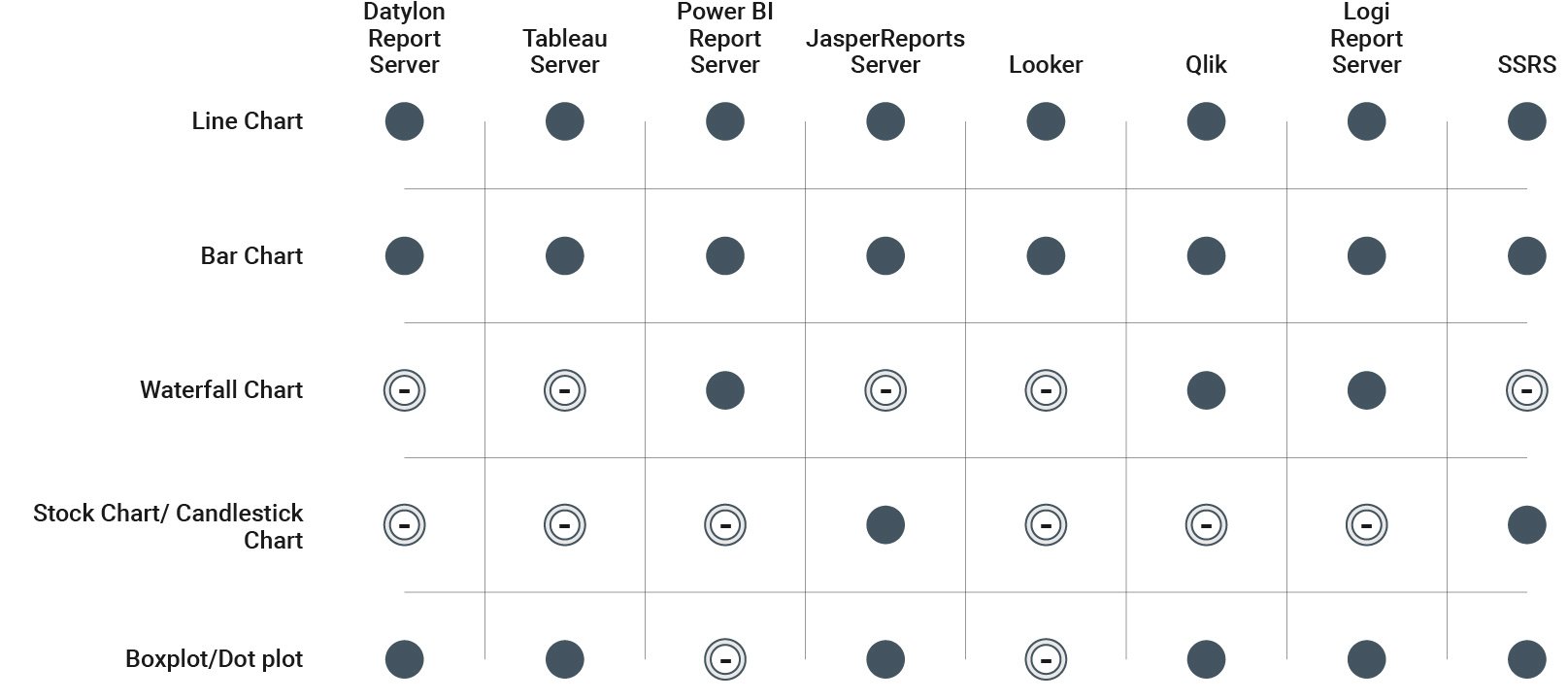
The positive aspect is that all the tools offer the capability to create various financial charts. Nonetheless, the ease of creating these charts varies, with some tools providing a more straightforward process than others. Importantly, each tool has at least one type of chart that requires a workaround instead of being available as a default option.
Customization and Branding
When evaluating the different tools, a crucial consideration is their capacity to offer users a personalized and branded reporting experience. This paragraph delves into the comparison of these tools by evaluating their effectiveness in assisting users to personalize automated multi-page reports based on individual preferences.
Branding options can include personalized color schemes, fonts, and styles, while customization involves the ability to fine-tune each data point independently and modify the appearance of axes, labels, and other components in the smallest graphic detail.

Datylon Report Server offers an extensive range of customization and branding options. While other tools provide this capability, it may require a bit more effort or involve a workaround. The choice is yours to determine the significance of delivering a personalized and branded report.
Automation and embedding
When we evaluate these tools, a crucial aspect we consider is how well they can automate the reporting and be embedded into other systems. This means looking at whether the tools can automatically generate reports on a schedule and if they allow reports to be easily integrated into different platforms.
This is important because automation saves time and resources, ensuring reports are consistently generated without manual effort. Embedding capabilities make it simpler to share and use the financial insights in different platforms, improving overall efficiency and accessibility.

On this feature, all of the tools truly excel, underscoring why they were selected as top choices for creating automated financial reports. Each tool offers the capability to automate report generation, schedule this process, and seamlessly embed the generated reports in another platform.
Financial Reporting Standards
In financial reporting, adherence to recognized standards such as GAAP (Generally Accepted Accounting Principles) and IFRS (International Financial Reporting Standards) might be important to your organization. When this topic is crucial to your report, ensure they align with these standards to guarantee accurate, transparent, and consistent reporting.
The upcoming table presents the outcomes of our research, detailing whether the tools mentioned compliance with GAAP/IFRS standards, provide the use of reporting templates for consistent and comparable results, and offer audit logs for reporting processes, fostering transparency and accountability.
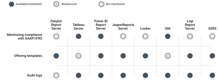
While the table doesn't explicitly state GAAP/IFRS compliance for all tools, this doesn't necessarily mean these tools can't handle these standards. If adhering to GAAP or IFRS is essential for your financial reports, it's crucial to verify that your chosen tool can meet these requirements.
Learning Curve and Support
In assessing these tools, a crucial aspect to examine is the learning curve, the accessibility of training resources and a community, and the customer support that they offer. Understanding the learning experience and available support is key to making an informed decision about the suitability of each tool for your specific requirements.
The rating for customer support is represented by the number of stars in Capterra reviews.

When it comes to this aspect, there are some differences between the tools. While most require some time to master, many offer training, helpful communities, or great customer support to smooth the learning curve.
Established tools in the market tend to have more extensive training resources and a larger user community. However, it's important not to overlook smaller companies, such as Datylon Report Server, which excel in customer support and are often more flexible in adapting the tool to your preferences—an aspect that may not always be achievable with longer-standing tools in the market.
Pricing and Licensing
When evaluating these tools, a critical factor to consider is their pricing and licensing models. It's important to note that the pricing structure varies significantly for each tool, and what is included in the price can vary as well. Since most prices are not readily published online, we have decided not to include them here.
Though, we will provide some key factors to consider when comparing prices:
- Number of required users and price per user type: Determine whether vendors charge per user and evaluate their pricing structure accordingly. Some vendors may offer flexible pricing options based on the number of users.
- Number of reports published per month: Assess whether vendors include a standard package of report publications or if additional fees apply based on usage. Understanding this aspect helps in budget planning.
- Required training and support: Include expenses related to training and ongoing support. These investments are crucial for the project's long-term success and should be incorporated into the budget accordingly.
- Additional infrastructure and maintenance costs: Consider expenses for hardware, server maintenance, IT assistance, and other associated costs that may arise. This comprehensive approach ensures accurate budgeting and helps avoid unforeseen expenses.
Find the Perfect Tool
Our comparison of Datylon Report Server, Tableau Server, Power BI Report Server, Qlik, Looker, JasperReports Server, Logi Report Server, and SQL Server Reporting Services (SSRS) reveals that each tool has its own strengths and weaknesses for financial data visualization. No single tool is perfect for every situation.
The key to finding the most suitable tool is to understand your specific needs and choose the right tool accordingly. Some tools are better at data analysis, while others excel at creating personalized reports.
Remember, the best financial reporting solution might involve using more than one tool. Some tools are great at crunching numbers, while others shine at creating impressive reports. By combining different tools, you can create a reporting system that perfectly fits your needs.
Discover Datylon Report Server
Datylon Report Server stands out as a powerful platform for automated and embedded reporting. With its ability to automate the publication of the most visually appealing and informative reports using carefully designed templates, Datylon supports organizations and individuals to make data-driven decisions with confidence.
To explore how Datylon can benefit your organization, you can book a demo with one of our experts. They are ready to guide you through the process and demonstrate how our solution can improve your reporting capabilities.
For a deeper dive into automated reporting and Datylon's capabilities, read our comprehensive guide.
Important: Technology changes rapidly. While we've done our best to provide accurate information in this blog article, always verify the details directly with the tool providers before making a decision.
👉If you're keen on crafting custom data visualizations, visit our Bespoke Data Visualization Solution page, where we showcase numerous examples of our past projects.
Further Readings/Resources
www.tableau.com/solutions/finance-analytics
learn.microsoft.com/en-us/power-bi/
community.jaspersoft.com/documentation/
www.jaspersoft.com/solutions/financial-analytics-software
cloud.google.com/looker/docs/intro
www.getapp.com/finance-accounting-software/reporting/w/looker/
www.qlik.com/us/products/qlik-reporting
devnet.logianalytics.com/hc/en-us

Dieuwertje van Dijk - Data Visualization Designer
Data, graphic design, illustration, food and mountains let her dopamine neurons spark on a daily basis. Most of the year she lives in Georgia where she spends her free time enjoying nature in a rooftop tent, eating khinkali and drinking wine.

