With the fourth wave of Covid-19 infections currently hitting Europe, it seems the subject of the global pandemic is going to remain a part of daily mainstream news coverage. Not surprisingly, most global media reports regularly address public health, social unrest, vaccinations, government measurements, etc.
Rest assured, we at Datylon do our best to avoid the spreading of the virus and always adhere to the current rules or restrictions and advice from the public health and government authorities. But what we also observed is a constantly growing number of news from online media regarding the current pandemic and increasingly mixed and wide-ranging responses from people.
Exposure to different media reports, especially if they deviate from being objective or truthful (or emotionally balanced) may cause a substantial shift in people's attitude towards the very topic of such news. And in the case of public health, it is important there is at least a coherent overview of what is being published and what the responses of the readers were.
Innovative experiment
Shortly before the pandemic took over a significant part of our lives, the Flemish Government's Agency for Care and Health (in Dutch: Agentschap Zorg en Gezondheid), organized an innovation experiment within the Sandbox project. Specially designed to offer an environment for startups to safely experiment with new technologies and products, Sandbox allows the Flemish government to collaborate with startups. Among other things, this helps in supporting and sustaining the innovation culture in Flanders.
For one of such innovative experiments, Datylon collaborated with data science and analytics company Klarrio. Being an expert in real-time streaming data and analysis and processing, Klarrio was able to contribute to the project that involved continuously screening and reporting online media related to public health. Datylon supported the project with advanced data visualization enabling a better understanding of collected data.
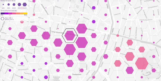
As a result, the Agency for Care and Health was able to analyze and visualize the data collected in the screening process. This, in turn, allows the agency (and the government) to fully monitor sentiment trends and react to them in a timely manner.
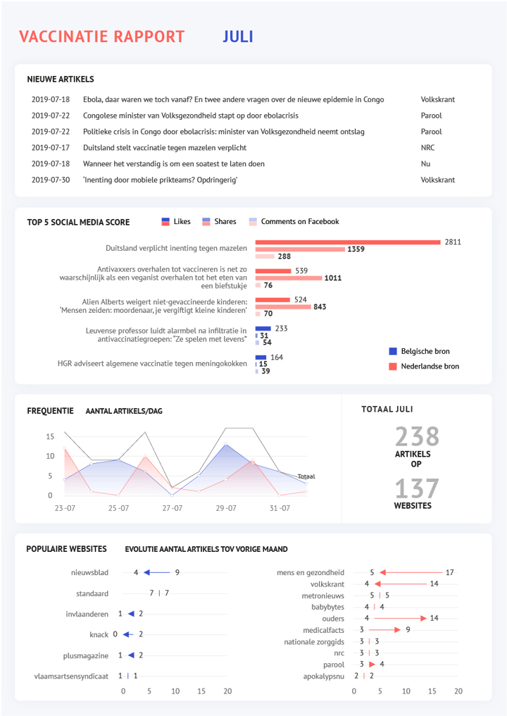
The report
The output of the experiment was two daily reports on the media screening and historical trends.
The Sandbox experiment perfectly demonstrates how effective data capture and visualization can transform standard reporting into an easily-understood format for regular monitoring and updates.
The experiment was just this: the test. But what does it mean for the health agency, should the process be deployed? Knowing the difference between internal and external sentiments would allow them to be more informed and prepared to take intelligent, data-driven steps in order to act or realign.
This report was designed with Datylon for Illustrator plug-in and automatically produced with Datylon Report Server. You can find and download the file here.
With our advanced dataviz and digital expertise, we can also put your data to work to maximize your opportunity for data-driven change. Check out some of our projects to see how we can make your data actionable.
Ready to share your data challenge? Contact us about your custom digital & dataviz needs.