Another couple of weeks have passed and here we are with yet a new version (R44) of our Datylon chart maker. It includes some interesting changes and improvements, often suggested to us by our users.
We now have a super handy Auto Fit feature, that automatically resizes your plot area to fit the labels, and we offer new color palettes, that make your data visualizations stand out even more. Some smaller updates will also make your life easier when creating charts or graphs. Read more below.
Download Datylon for Illustrator now or sign in to the Datylon web app and enjoy the new version!
ADVANCED STYLING / RE-USE & COLLABORATE
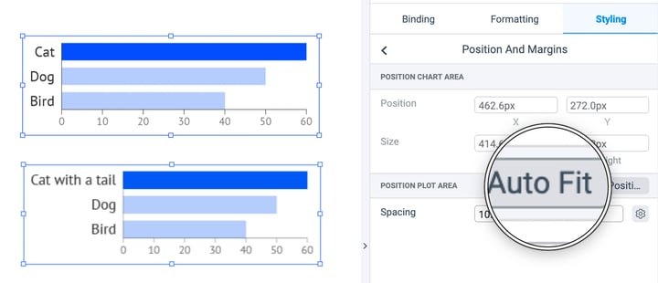
Auto-fit labels
Surely you have already created a chart noticing there was not enough space for your labels when new data was uploaded. Manually adding margin was the only option. You can now update your chart with new data with confidence. With our new feature 'Auto Fit' enabled, the plot area of your chart will automatically resize to fit the labels nicely within the boundaries of the chart area. Super handy and a huge time saver! Discover more re-usability features.
ADVANCED STYLING
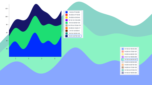
New color palettes
There is no question color is an essential aspect of data visualization. The right color choice contributes a lot to the readability of a chart. So we have reviewed our color palettes in this light and added new default palettes with elegant contemporary colors optimized for data visualizations. Try them out and let us hear what you think! Learn more about how to work with colors and chart coloring in Datylon chart maker.
ADVANCED STYLING
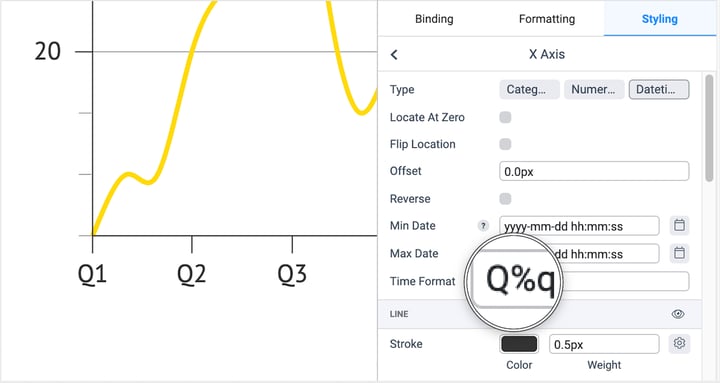
Quarter axis labels
Did you know you could format your dates as quarters? If your data is delivered in any kind of data format, you can style your axis labels as quarters. Use Styling > X or Y axis > Type: Datetime > Time Format : Q%q. More tips on date & time formatting in Datylon.
And there is more. As usual, we also added some smaller or even slightly hidden features that nevertheless make your life easier when creating graphs. Read more in detail about them in the R44 release notes in the Datylon Help Center.
Don't forget to download the latest version of Datylon for Illustrator to benefit from all these improvements! Alternatively, you can also try them out in our Datylon web app.
Your #chartsmatter and enjoy designing! 😉