
On Monday morning, Maya, data analytics manager at Northstar, receives a spreadsheet. It contains twelve months of sales, five product categories, four regions, delivery times, campaign spending, customer satisfaction scores, and operating costs for Northstar (a fictional consumer-goods company). The data is complete. The formulas are correct. The problem is that Maya has to present the results to management on Friday. And the spreadsheet does not make the story obvious. There are a lot of questions to answer:
- Which products are driving growth?
- Why did revenue slow in the second half of the year?
- Are customers in some regions waiting longer for deliveries?
- Is higher advertising spend actually producing more qualified leads?
- And if management only remembers three things from the report, what should those three things be?
That’s when Maya turns to data visualization. Intrigued? Keep on reading!
What is data visualization?
| Data visualization is the practice of representing data visually through charts, graphs, plots, maps, dashboards, and other graphical forms so that comparisons, patterns, trends, relationships, and outliers are easier to understand. |
In simpler terms: Data visualization helps people see what the data is saying. Its purpose is to make the structure hidden inside those numbers easier to perceive. For Maya, that means turning Northstar’s spreadsheet into something management can understand without repeating her analysis from scratch.
|
Question |
Short answer |
|
What is data visualization? |
Representing data visually using charts, graphs, maps, plots, dashboards, and related formats. |
|
Why is it useful? |
It makes comparisons, trends, relationships, distributions, and exceptions easier to recognize. |
|
Who uses it? |
Analysts, designers, researchers, journalists, managers, consultants, educators, and many others. |
|
What makes it effective? |
Accurate data, an appropriate chart, clear hierarchy, honest scales, context, and accessible design. |
|
What makes it ineffective? |
A visualization that hides important information, exaggerates differences, or makes the viewer work too hard. |
Now Maya knows what data visualization is. But before she starts creating charts, she needs to answer a question: If all the numbers are already in the spreadsheet, why not simply send management the spreadsheet?
Why does data visualization matters?
Northstar’s spreadsheet contains everything management needs. Technically. But information being present is not the same as information being clear. Northstar’s management team could receive six worksheets. Potentially, they could inspect all six sheets and analyse the situation. But that would require time, attention, and effort. Answering a simple question like: “Which product category performed best?”, requires management to locate the right sheet, compare values, and identify the largest number. That is precisely the work a good visualization can reduce.
Data visualization helps solve five common problems:
1.There’s too much information
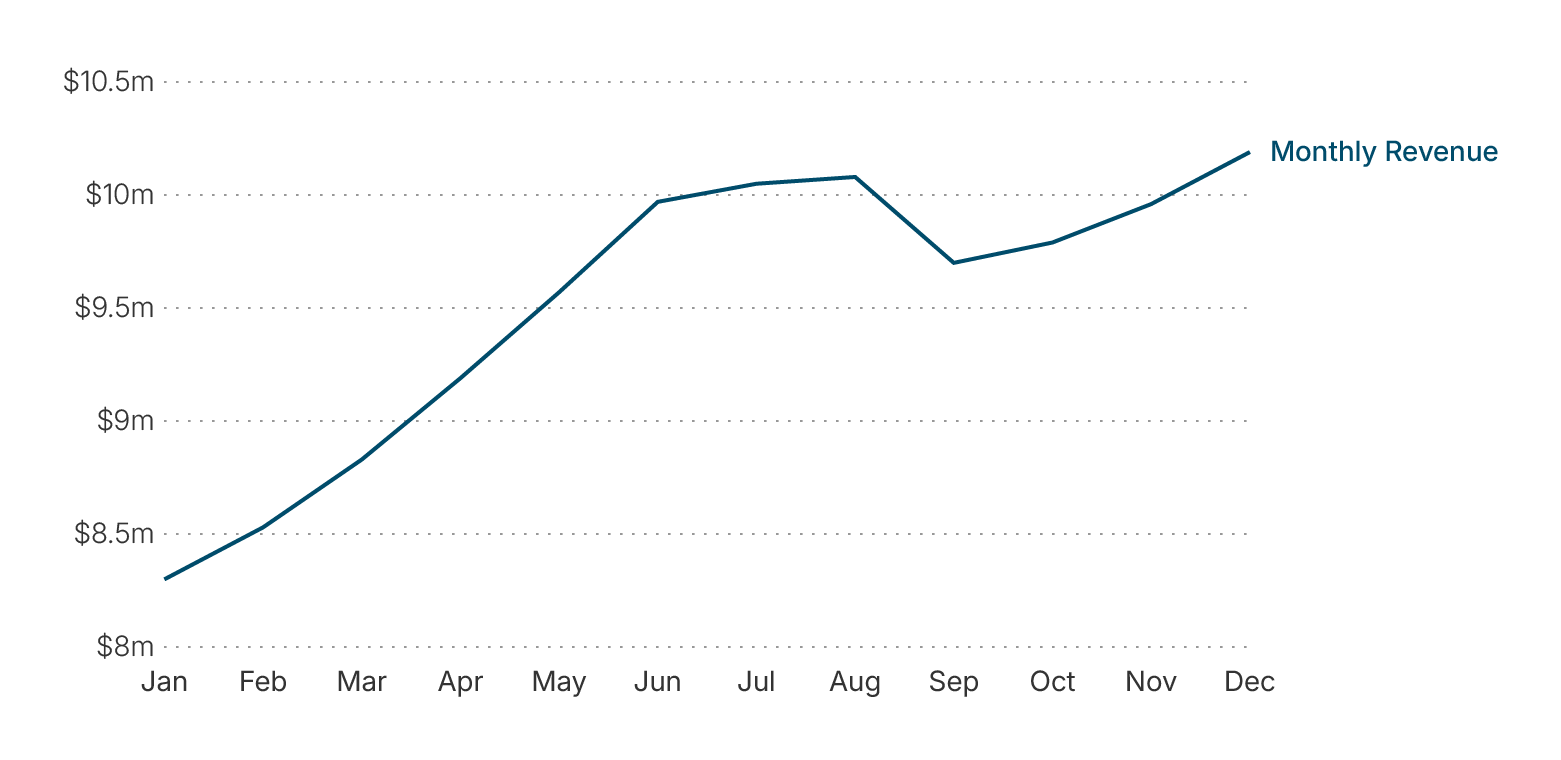
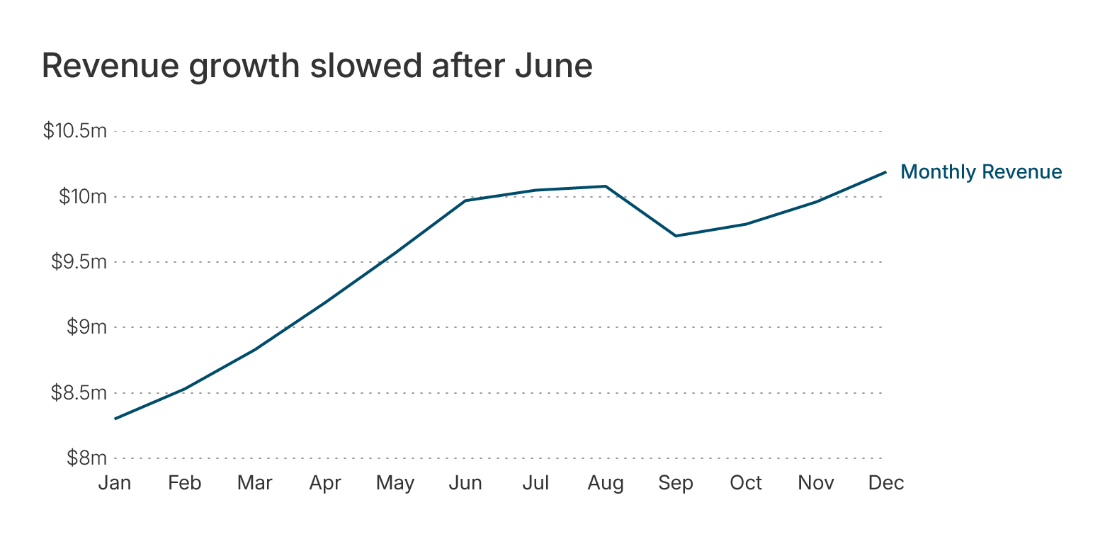
Northstar’s spreadsheet has thousands of individual values. Looking at them one by one makes it difficult to understand the overall picture. When Maya plots monthly revenue, the pattern becomes visible immediately: growth was strong during the first half of the year and then began to flatten. The chart does not contain more information than the table. It makes the existing information easier to perceive.
2. Important differences are easy to miss
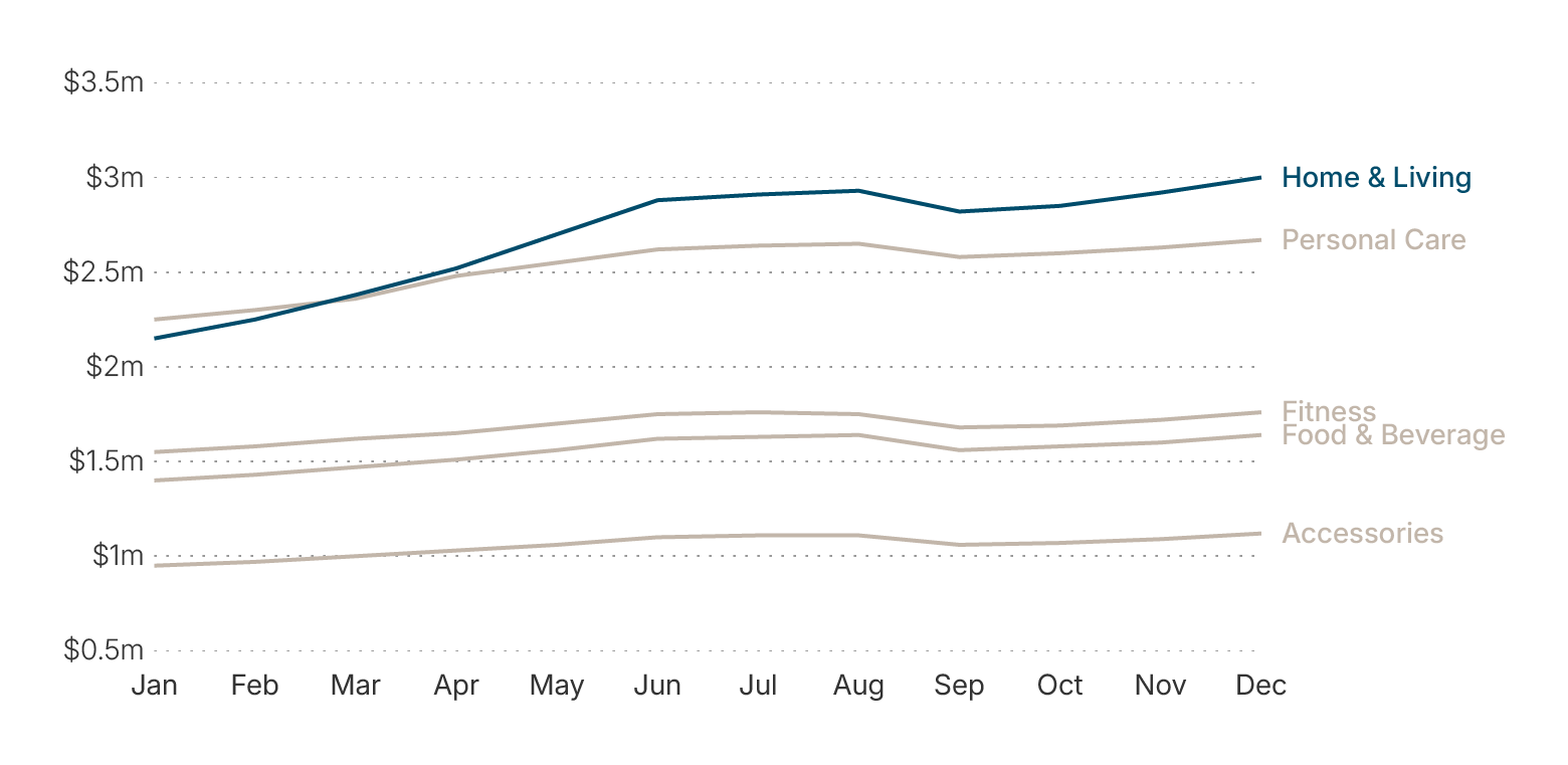
Northstar’s five product categories all grew during the year. But “Home & Living” grew much faster than the others. Inside a table, that difference is easy to overlook. In a line chart, it is immediately visible.
3. Different audiences know and understand data differently
Maya works with these numbers every week. Management does not. What feels obvious to her may not be obvious to someone seeing the data for the first time. Visualization helps bridge that gap. Instead of expecting the audience to understand Northstar’s internal reporting structure, Maya can present the relationship that matters directly using a simple bar chart. Bar charts are easy to understand and most of the people are familiar with them.
| If you want to dig deeper into how to work with data in data visualization, read our article about data and statistics concepts. |
4. Data rarely explains itself
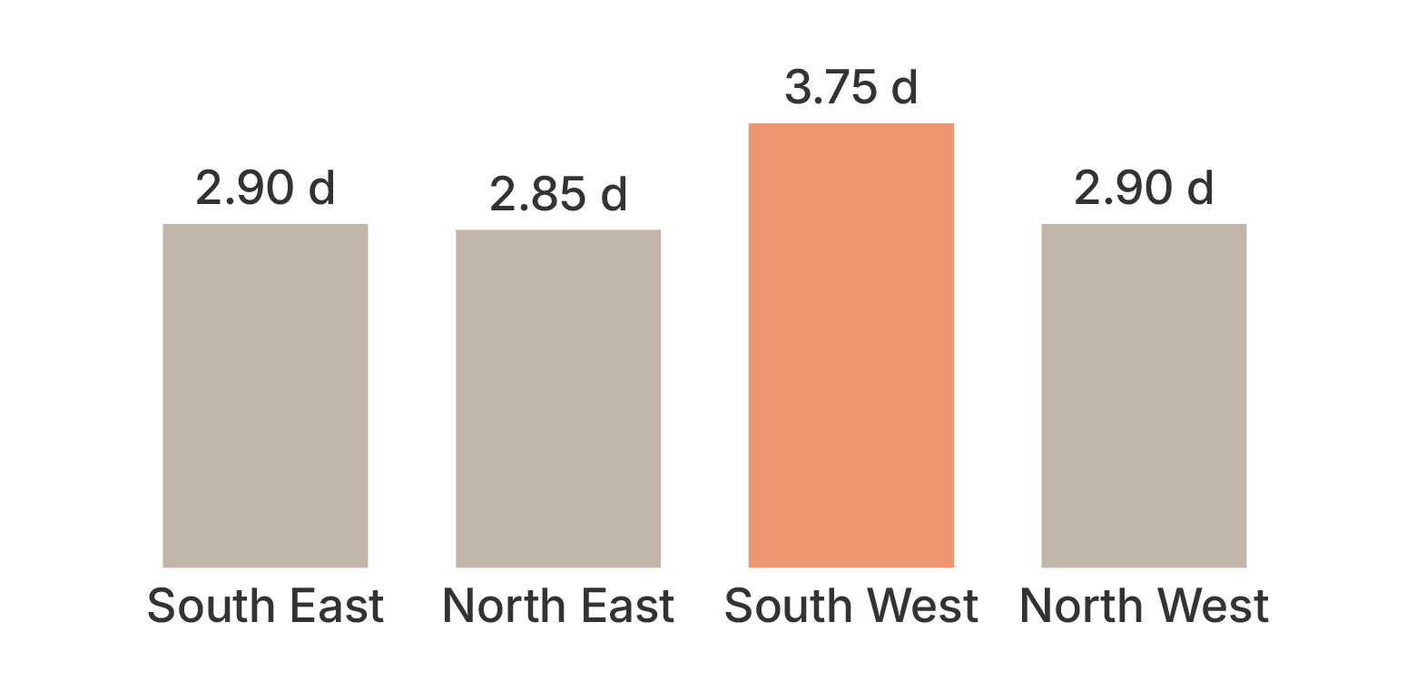
One value in the spreadsheet shows that average company delivery time rose from 2.8 to 3.4 days. Is that bad? Probably, yes. But the number becomes much more meaningful when Maya compares regions and discovers that most of the increase comes from the South-West. Now the issue is no longer: “Delivery time increased”. It becomes: “Delivery delays are concentrated in one region”. That is much more actionable. Could Maya do that just with the spreadsheet analysis? Yes. But it’s way easier to see the difference using a chart. What is even more important is that it simplifies the process of sharing the findings with management and backs them up with the proof.
5. Decisions often need to be made quickly
Northstar’s management team does not need to study the entire dataset. They need to know:
- What is going well?
- What needs attention?
- What should we investigate next?
The purpose of the visualization is therefore not to show everything Maya knows. It is to make the most important relationships visible. And that brings her to the first real design decision. What kind of chart should she use for each question?
What are the main types of data visualization?
At first, Maya opens her visualization tool and sees dozens of possibilities: bar charts, line charts, scatter plots, treemaps, heatmaps, bubble charts, histograms. The number of options makes the task feel more complicated than it is. The solution is to stop thinking about chart names and start thinking about the relationship in the data. Most visualization problems fall into a relatively small number of families.
|
What Maya needs to show |
Useful chart types |
Northstar question |
|
Comparison |
Bar chart, column chart, dot plot, lollipop chart |
Which product category generated the most revenue? |
|
Change over time |
Line chart, area chart, column chart, slope chart |
How did revenue change during the year? |
|
Distribution |
Histogram, box plot, density plot, violin plot |
How widely do delivery times vary? |
|
Relationship |
Scatter plot, bubble chart, heatmap |
Does higher marketing spend relate to more qualified leads? |
|
Part-to-whole |
Stacked bar, treemap, pie chart, donut chart |
How is Northstar’s operating budget divided? |
|
Geography, flow or networks |
Choropleth map, symbol map, Sankey diagram, network diagram |
Which regions have the highest delivery delays? |
1. Comparison charts: which product is performing best?
Maya begins with product revenue. Northstar has five product categories:
- Home & Living
- Personal Care
- Fitness
- Food & Beverage
- Accessories
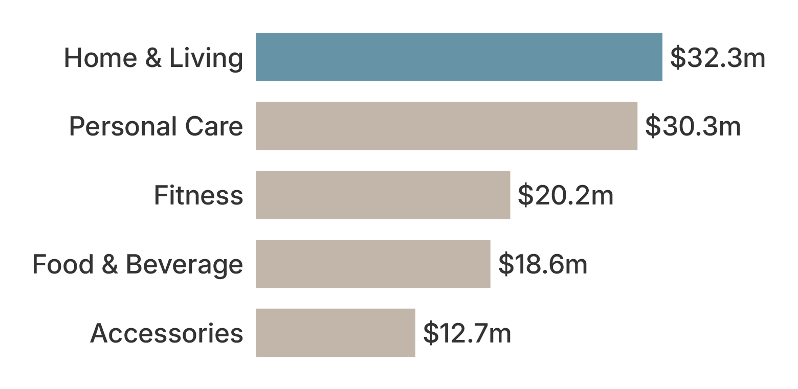
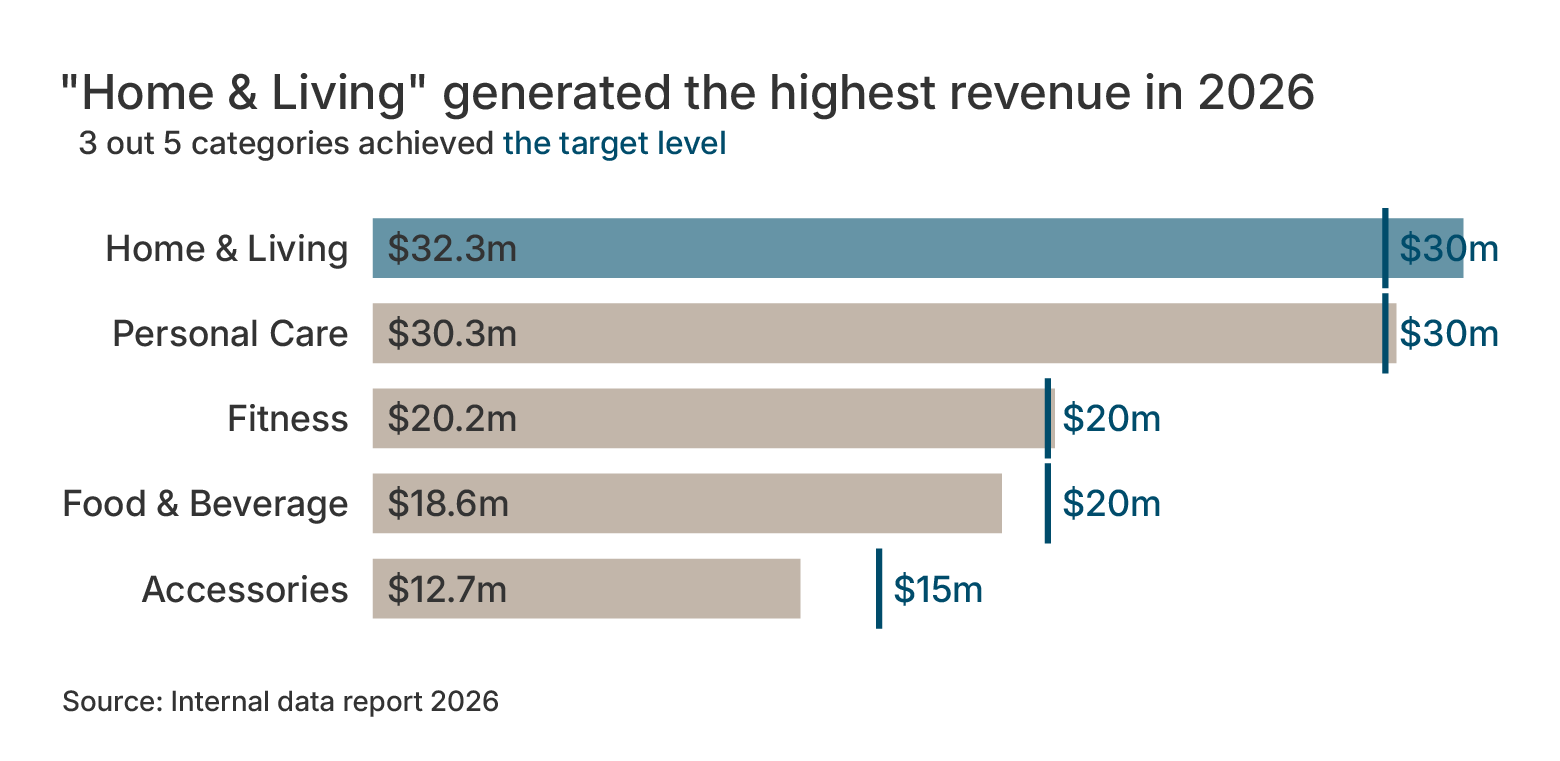
Northstar’s management team wants to know which category contributed most to revenue this year. A comparison chart is the natural choice. Maya creates a horizontal bar chart and sorts the products from highest to lowest revenue. Immediately, “Home & Living” stands out.
When comparison charts work well
Use them when asking:
- Which value is highest?
- Which category performs best?
- How large is the difference?
- How far are we from a target?
A bar chart is often effective because people can compare bar lengths relatively easily. If Maya had used a pie chart with five similar slices, management would have had to work harder to compare them.
But the bar chart answers only one question: “Which category generated the most revenue over the whole year?” It does not tell Maya how Home & Living became the leader. Was it already the strongest category in January? Did it grow faster than the others? Or did another category lead earlier in the year?
To answer that, Maya needs to stop looking at annual totals and introduce time.
2. Change-over-time charts: how did Home & Living become the strongest category?
Maya now plots monthly revenue for all five product categories from January to December. The line chart reveals something the annual bar chart could not. Home & Living was not the strongest category at the beginning of the year. Personal Care started January slightly ahead. During the first few months, the two categories remained close. But Home & Living grew more quickly through spring and overtook Personal Care in May. By the middle of the year, it had established a clear lead.
The chart therefore answers the question raised by the annual comparison. Home & Living became the strongest category because its revenue grew faster during the first half of the year.
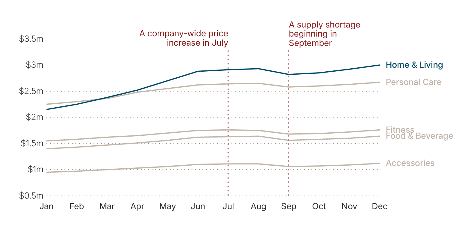
But the line chart reveals something else. After June, Home & Living continues to lead, yet its rate of growth begins to slow. The same flattening appears, to different degrees, across several other product categories.
So Maya’s question changes again. It is no longer: ”Which category performed best?” Now it is: “Why did growth slow in the second half of the year?” Maya adds two annotations to the chart: “A company-wide price increase in July” and “A supply shortage beginning in September”.
These events do not by themselves prove what caused the slowdown, but they give management relevant context for investigating it.
Use change-over-time charts when you need to show
- Growth
- Decline
- Seasonality
- Volatility
- Progress
- Before-and-after change
- When one category overtook another
The annual bar chart told Maya who won. The line chart explains how the ranking changed over time. But trends and totals can still hide another kind of problem. Northstar’s average delivery time, for example, looks only slightly worse than last year. If Maya looks only at the average, she might conclude that the change is minor. To understand whether that average is hiding a more serious issue, she needs to examine the full distribution.
3. Distribution charts: is the average hiding a problem?
Northstar’s average delivery time moved from 2.8 days to 3.4 days. That looks like a modest deterioration. Maya wants to know whether deliveries became slightly slower everywhere or whether a small group of severe delays is driving the average. Maya first creates a barcode chart of delivery times. Most deliveries still cluster around a relatively normal range. But a smaller group of very late deliveries creates a long tail. She then uses box plots to compare median delivery times for the four regions.
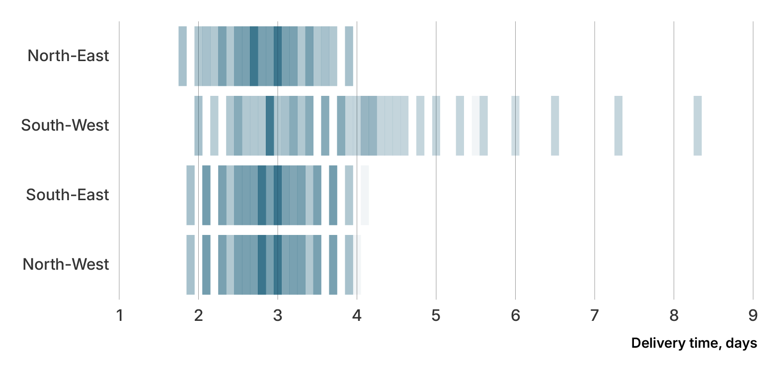
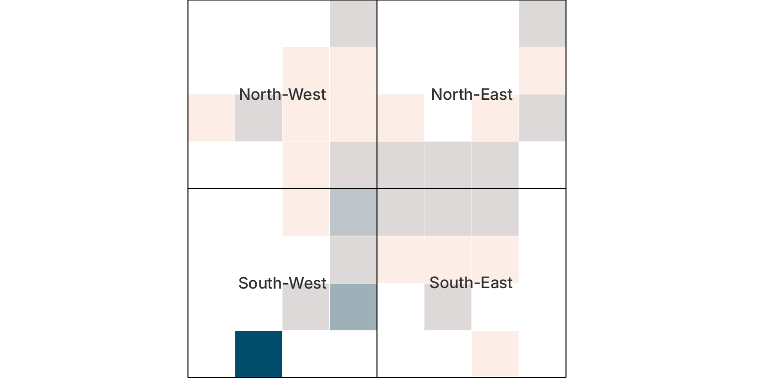
The South-West stands out with: a higher median delivery time, greater variation, more extreme delays. So the increase from 2.8 to 3.4 days does not mean all deliveries became equally slower. The deterioration is disproportionately concentrated in one region. The South-West stands out immediately. Its median delivery time is higher, and it contains far more extreme delays.
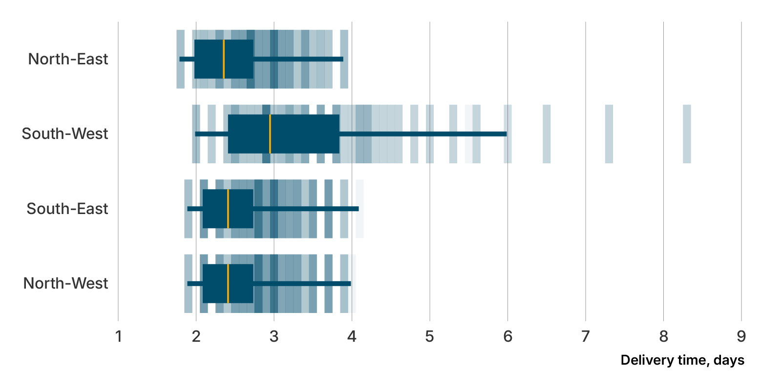
The management problem has changed again. It is not: “Delivery times are slightly worse everywhere”. It is: “A specific region is creating most of the delay”. This is why averages alone can be misleading. Two datasets can have the same average but very different shapes. Maya has now identified where delivery performance is breaking down.
Next she turns to marketing. The marketing director argues that higher campaign spending generated more qualified leads. But does the relationship actually exist?
4. Relationship charts: does more spending produce more leads?
Maya creates a scatter plot. Each dot represents one Northstar campaign. The horizontal axis shows campaign spending. The vertical axis shows qualified leads. A general upward pattern appears. Campaigns with higher spending tend to generate more leads. But the pattern is not perfect. Several expensive campaigns performed poorly, while one moderate-budget campaign performed exceptionally well. A table might have encouraged management to focus only on totals. The scatter plot makes the exceptions visible.
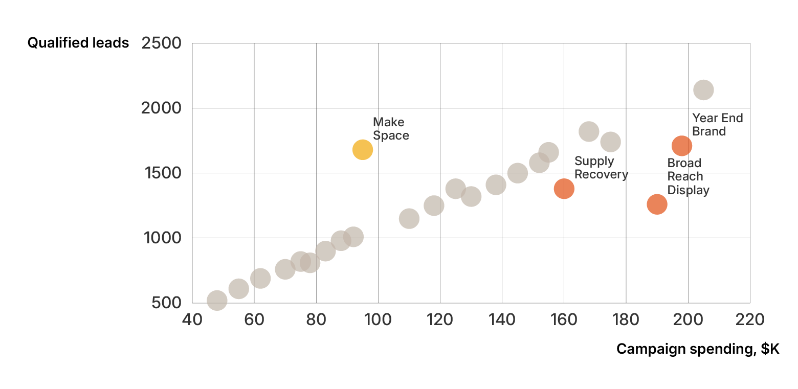
But Maya is careful not to overstate what the chart proves. A relationship does not automatically mean causation. The chart suggests that spending and leads are related. It does not prove that additional spending alone caused the increase.
The final high-level business question is financial: “Where is Northstar spending its money?”.
5. Part-to-whole charts: where does the budget go?
Northstar’s operating budget is divided across: production, logistics, marketing, technology, administration. Management wants to understand the overall composition. Because the categories form a meaningful total, Maya can use a part-to-whole visualization.
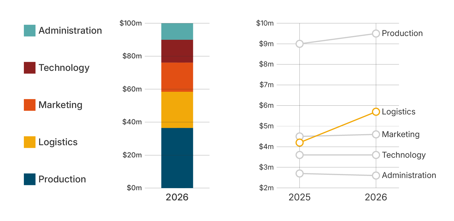
A 100% stacked bar chart becomes particularly useful when she shows the structure of the budget. But if Maya wanted management to compare this year with last year, part-to-whole charts would not help a lot. In this casea a slope chart provides a clearer comparison. Northstar’s biggest operational issue now appears to involve logistics. To understand whether it is geographically concentrated, Maya maps the data.
6. Maps: where is the problem happening?
Maya creates a regional tile map showing average delivery delay. One of the regions in the South-West is clearly darker than the other regions. Now three separate visualizations support the same conclusion:
- Distribution charts show unusually long delivery times.
- The budget chart shows rising logistics costs.
- The map shows that delays are concentrated geographically.
Good visualization is not just about producing individual charts. It is about building a coherent explanation from multiple pieces of evidence. By now, Maya understands which chart groups can be used for a particular question, but there is still a problem. For several questions, more than one chart would technically work. So how should she choose between them?
How do you choose the right chart?
Maya has learned that choosing a chart type should be based on the questions we’re trying to answer in this article. But real datasets rarely present one perfect answer. For Northstar’s product performance, for example, she could use a bar chart, dot plot, lollipop chart, or treemap. All of them can represent the same data.The better question is: Which one makes the answer easiest for this audience to understand? Maya uses a six-step process.
Step 1: Define the question
She begins with a sentence that is as detailed as possible. Not: “Show product details”. But: “Which product categories contributed most to annual revenue?". A clear question narrows the design choices immediately.
Step 2: Identify the relationship
Is the question about comparison, trend, distribution, relationship, composition, geography or flow? For product revenue, the answer is comparison.
Step 3: Understand the data
Maya checks what she actually has. Product revenue consists of:
- One categorical variable: product category
- One quantitative variable: revenue
That already eliminates many inappropriate chart types.
Step 4: Consider the audience
Northstar’s management team needs to understand the ranking quickly. They do not need an unusual or highly exploratory chart. So familiarity is an advantage.
Step 5: Choose the simplest chart that works
Maya chooses a sorted bar chart. Not because bar charts are always best. Because it answers this particular question with minimal effort. Complexity should solve a problem, not exist merely to make the visualization feel more sophisticated.
Step 6: Test it
Maya shows the draft to a colleague who has not seen the spreadsheet. She asks: “What do you notice first?” Her colleague answers: “Home & Living is clearly the largest category”. The chart is doing its job.
This kind of checklist helps a lot in most situations. But the actual process is not always linear. During the week, Maya has created dozens of charts that management will never see. Those rough charts helped her understand the data. They were only a step to the final charts and have a different purpose. That means all the chart types while being the same in essence can have a different purpose.
Exploratory vs explanatory data visualization
Early in the week, Maya works mostly in exploratory mode. She creates multiple versions of the same analysis. She filters. Changes axes. Tests correlations. Look for outliers. Most of these charts are temporary. Their purpose is to help her think.
By Thursday, that changes. Now she knows the main story. Revenue grew, but growth slowed after June. Home & Living was the strongest category. Delivery problems are concentrated in the South-West. Logistics spending increased. Marketing spend is related to lead generation, but performance varies significantly between campaigns.
|
Exploratory visualization |
Explanatory visualization |
|
Helps Maya investigate data |
Helps management understand a finding |
|
Can contain more detail |
Focuses attention |
|
Can be rough and temporary |
Needs deliberate design |
|
Supports analysis |
Supports communication |
|
Main question: “What is happening?” |
Main question: “What should the audience notice?” |
Her job is no longer to discover what happened. Her job is to make management understand it. Exploratory visualization helps you find the story. Explanatory visualization helps other people understand the story.
Once Maya moves from exploration to explanation, visual design becomes much more important. A technically correct chart is no longer enough. It has to be clear.
What makes a good data visualization?
Maya now has the right chart types. But she can still make them difficult to understand. So before assembling the final report, she reviews every chart using six principles.
1. Start with the audience and question
The chart should answer something the audience actually needs to know. Maya changes a vague chart title from “Monthly Revenue” to “Revenue growth slowed after June”. The chart has not changed. But management now knows immediately what to look for.
2. Make the important information easy to see
Northstar’s product chart originally gives all five categories the same visual emphasis. Maya changes that. She keeps most categories neutral and emphasizes “Home & Living”. Now the visual hierarchy matches the story. If everything is highlighted, nothing is highlighted.
3. Choose the simplest useful visual form
Maya experiments with a 3D column chart for regional revenue. It looks impressive. It also makes the bars harder to compare. She removes the 3D effect. The chart becomes less decorative and more useful. A simple test helps: “If I remove this element, does the chart become harder to understand?” If not, it may not be necessary.
4. Use scales, labels, and context honestly
Maya notices that one draft bar chart begins its axis at 18 million rather than zero. That makes a relatively small difference between two product categories look enormous. She fixes the scale. She also adds: units, reporting period, data source, target where relevant, short annotations. Context helps the audience interpret the result rather than merely see it.
5. Use color with a purpose
Northstar’s brand palette contains six colors. Maya could use all of them. She does not. Instead, color has specific jobs: highlight the main finding, identify consistent categories across pages, distinguish positive and negative values, show intensity where appropriate. Color becomes a communication tool rather than decoration.
6. Design for accessibility and uncertainty
Maya checks whether important distinctions depend on color alone. Where necessary she adds: direct labels, symbols, line styles, text descriptions. She also avoids presenting forecasts as certainties. When the report includes next quarter’s projected revenue, she shows a range instead of a single precise-looking line. The goal is not to make the forecast look confident. It is to represent the uncertainty honestly.
Maya now has a set of principles for good visualization. Yet mistakes are often easier to notice in concrete examples. Before finalizing the report, she performs one more review. This time looking specifically for what can go wrong.
Common data visualization mistakes
Trying to show everything
One early dashboard contains fourteen KPIs. Every metric is important to someone. But together they create no clear hierarchy. Maya reduces the executive page to the few measures needed for the management discussion and moves supporting detail elsewhere.
Choosing a chart because it looks interesting
A treemap initially seems attractive for product revenue. But management needs to compare five values precisely. The bar chart is easier. Maya keeps the treemap out.
Using vague titles
Instead of: “Regional Delivery Performance”, Maya writes: “Delivery delays are concentrated in the South-West”. The second title turns a topic into a finding.
Using too many colors
While drafting a first version of the bar chart, Maya gives every month a different color. Nothing stands out. Maya replaces multiple colors with one consistent color for the series and highlights only the period where growth slows.
Relying too heavily on legends
A line chart Maya created has four regions and a legend underneath. Readers must constantly look down and back up. Maya labels each line directly at the endpoint. The effort required to decode the chart decreases and also makes it more accessible.
Hiding context
Northstar’s customer satisfaction fell from 8.4 to 8.0. Without context, that change seems small. When Maya adds the company’s target of 8.5 and the fact that the South-West fell to 7.2, the issue becomes much clearer.
Ignoring edge cases
The report will be reused next quarter. Maya asks:
- What if a new product category appears?
- What if a region has missing data?
- What if one value becomes negative?
- What if a label becomes much longer?
- What if a new value is twice as large as the current maximum?
These questions matter because a chart designed for one fixed dataset may fail when the data changes. That is particularly important once visualizations become part of a recurring reporting process. Maya now has the principles and knows the pitfalls. The last step is to turn them into a repeatable method.
A practical data visualization workflow
By Friday morning, Maya’s process can be summarized in seven steps.
1. Check the data. Before visualizing anything, she verifies: missing values, duplicate records, units, calculations, dates, categories, unexpected values. In Maya’s case the data was complete. But it’s not always like that. If you can’t get the full data needed for a chart, just don’t create it. A beautiful chart cannot rescue incorrect data.
2. Define the question. For every chart, Maya writes down what the audience needs to understand.
3. Identify the relationship. Comparison, trend, distribution, relationship, composition, geography, or flow?
4. Try several charts. Maya does not assume the first option is the best one. She tests alternatives.
5. Simplify. She removes anything that does not contribute to understanding.
6. Add context. Maya adds: labels, units, source, benchmarks, targets, annotations, definitions.
7. Test with the audience. Finally, she asks someone unfamiliar with the analysis to explain the chart back to her. If the intended message is not clear, she revises it.
For one presentation, this workflow is manageable. But Northstar’s report is not a one-time exercise. Management receives it every month. That changes the problem again. Maya no longer needs to think only about individual charts. She needs to think about the system that produces them repeatedly.
Data visualization in reports
The first monthly report looks good. But Maya soon discovers a new challenge. Next month values will change, categories may change, new data will arrive, different people may update different pages, some charts may need new labels, management will expect the same visual language.
Creating one good chart is one challenge. Creating fifty good charts consistently every month is another. Reports therefore need more than individual design decisions. They need rules.
Northstar defines consistent chart styles, colors, typography, scales, labels, layouts, templates. Now management does not have to re-learn the visual language each month. A blue target line always means the same thing. The same product categories use the same conventions. The same types of comparisons use the same chart logic. Consistency reduces cognitive effort. It also builds trust.
Why consistency matters even more in automated reporting
Northstar eventually decides to automate parts of the reporting process. This creates a new advantage. The company can produce updated reports faster. But it also creates a new risk. A poor design decision made, manually affects one chart. A poor design rule inside an automated system can affect hundreds or thousands of charts. That means automation does not reduce the importance of visualization design. It increases it.
Reusable chart and report templates become valuable because the design logic is established deliberately and then applied consistently as the data changes. At this point, Maya faces one final presentation choice. Should management receive a fixed report that communicates the key findings? Or should they receive an interactive dashboard where they can explore everything themselves? The answer depends on what they need to do.
Static vs interactive data visualization
For Northstar’s monthly management meeting, Maya chooses mostly static visualizations. The conclusions are known. The audience needs a focused narrative. The report should answer the following questions: “what happened?”, “why does it matter?”, “what requires attention?”.
But the operations team has a different need. They want to investigate individual regions, warehouses, and time periods. For them, an interactive dashboard makes more sense.
|
Static visualization |
Interactive visualization |
|
Best for focused communication |
Best for exploration |
|
Works well in reports and presentations |
Works well in dashboards and web applications |
|
Provides a fixed reference |
Allows filtering and drilldown |
|
Gives the creator strong layout control |
Lets different users answer different questions |
Neither format is automatically better. The right choice depends on the task. Maya uses static charts to explain. The operations team uses interactive charts to investigate. The important point is that the technology follows the user's needs. Not the other way around.
How does data visualization make a difference?
By Friday afternoon, Maya has not changed Northstar’s data. She has changed the way people can understand it.
The management team can now see that:
- Home & Living is the strongest product category.
- Overall revenue is still growing, but growth slowed after June.
- Delivery problems are concentrated in the South-West.
- Rising logistics costs and delivery delays appear to be connected operationally.
- Higher campaign spending is generally associated with more leads, but campaign efficiency varies significantly.
None of these insights were invented by the charts. They were already present in the data. Charts made them easier to detect, communicate, and discuss. That is ultimately what good data visualization does. It does not replace analysis. It does not replace judgment. And it does not make every decision automatic. It makes the evidence easier to see.
Frequently asked questions about data visualization
What is data visualization in simple terms?
Data visualization means representing data with visual forms such as charts, graphs, plots, maps, and dashboards so people can understand patterns and relationships more easily.
In Northstar’s case, that means turning a spreadsheet of sales, delivery, marketing, and budget data into visual evidence management can interpret quickly.
Why is data visualization important?
Data visualization helps people recognize comparisons, trends, distributions, relationships, and exceptions that may be difficult to identify from raw numbers alone.
It reduces the work required to move from data to understanding.
What are the main types of data visualization?
The most common visualization families are:
- Comparison
- Change over time
- Distribution
- Relationship
- Part-to-whole
- Geography, flows, and networks
Each family is suited to a different kind of question.
What is the best chart for data visualization?
There is no single best chart.
The right chart depends on:
- The question
- The structure of the data
- The audience
- The level of precision required
- The context in which the chart will be used
For example, Maya used:
- A bar chart to compare product revenue
- A line chart to show revenue over time
- A box plot to compare regional delivery distributions
- A scatter plot to explore marketing spend and leads
- A stacked bar to compare budget composition
- A map to show delivery delays by geographic location.
What is the difference between static and interactive data visualization?
A static chart usually represents one particular relationship or dataset.
An interactive data visualization combines several metrics so users can monitor or explore a broader subject.
Northstar’s management report uses static data visualizations (single charts) to communicate a narrative. And interactive data visualizations (operations dashboards) to explore performance from different angles.
Can data visualization be misleading?
Yes. A visualization can create a misleading impression through:
- Inappropriate chart choices
- Truncated or inconsistent scales
- Missing context
- Selective time periods
- Incorrect calculations
- Confusing colors
- Hidden uncertainty
Good visualization should make the data easier to understand without making it easier to misinterpret.
Do I need advanced software to create good data visualizations?
No. A simple, well-designed bar or line chart can be more effective than a sophisticated visualization.
More specialized tools become useful when you need:
- Advanced chart types
- Precise design control
- Reusable templates
- Collaboration
- Interactive visualizations
- Automated reporting
- Embedded visualizations
- Large-scale report production
The goal is not to use the largest number of chart types. It is not to make the most colorful dashboard. It is not to impress the audience with technical complexity.The goal is simpler.
Help people see what matters, understand it correctly, and know where to look next.
If you are unsure where to begin, do not begin with the chart library. Begin where Maya did—with one question: What does my audience need to understand?
Then choose the simplest visualization that makes the answer easier to see.
You can start making charts right now with a free Datylon chart maker.
Conclusion
Maya started with a complete dataset but no clear story. By asking better questions, choosing the right visual relationships, and adding context, she turned Northstar’s numbers into something management could understand and use.That is the real purpose of data visualization. It is not about making data look more impressive. It is about making important patterns easier to see, explain, and act on.
If you are unsure where to begin, start with one question: What does my audience need to understand? Then choose the simplest visualization that makes the answer clear.
Additional Resources
80 types of charts and graphs
Do you speak dataviz?
Do you speak data?
Bad data visualization and how to fix it
Why data visualization is important?
What is automated reporting? A complete guide
Do's and don'ts in the report design
Static vs Interactive charts
Mind your data visualization
A guide to data visualization best practices