The end of 2021 is almost here. And what a year it was. Surely, we all hoped for some things to go differently this year. Nonetheless, we felt the past twelve months were challenging, exciting, and frightening at times... But we all learned a lot and grew even more!
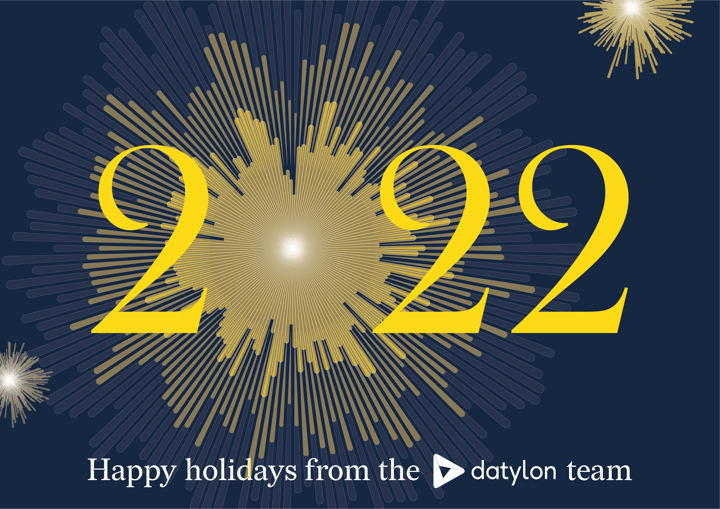
Happy holidays
For this year’s ‘happy holidays’ card, we created fireworks using the data from the World Happiness Index of the last three years. The inner layers of the firework are based on the World Happiness Reports of 2020 & 2021 where the length of each "ray" represents the happiness score of one country. We see still too many countries with lower scores. But we are hopeful. We wish all countries in the world the highest possible happiness score and that’s why we visualized it with the sparkling outer layer!
We created the 'fireworks' from the data in the Datylon for Illustrator chart maker plug-in and finished the design of the holiday card in Adobe Illustrator.
We would love to wish you and your families, friends, and significant others very happy holidays. May this time of the year bring you peace and lovely memories.
Datylon in 2021
This year, we accomplished a lot. So let's summarize how Datylon evolved in 2021:
PRODUCT
-
We released five new Datylon for Illustrator & Datylon web app updates!
-
A lot of new chart features were added or improved to help you style your charts exactly as you want them. And faster!
-
Productivity is also increased by multi-select, allowing you to change common chart properties on multiple charts all at once.
-
We strive to be future-proof, so we support new Mac hardware and Adobe Cloud documents.
-
And in the most recent product release R48, we added a new chart type to our chart library: the Datylon Treemap.
-
And in case you want to get the most out of Datylon, we added a lot of useful content in the Help Center, such as the chart properties articles or the new video tutorials.
-
We received 13 amazing reviews on Capterra. Lucky number for Datylon!
-
We added a new category: "Illustrator Chalk Talk". It's a series of tutorials on how to make different charts and graphs in Adobe Illustrator. So far we covered a heatmap, a dot plot, a bubble chart, and a line chart. More to come very soon!
-
We expanded our "Dataviz Best Practices" with a lot of really insightful articles that just can't be missed.
COMPANY
-
We updated and refreshed the Datylon brand identity.
-
We welcomed some new team members this year.
-
We published a bunch of Datylon's enterprise customer stories about our clients from different sectors: non-profit, government, industry, financial services, media/publishing, etc.
-
We also added a few insightful digital & dataviz projects we were involved in. Have you heard of Project Mahi? Make sure to follow their impressive trans-Atlantic journey.
We have many plans and exciting ideas for the year 2022 and we truly hope you will join us to be a part of this journey. All the best in the New Year! 🎆
The Datylon Team