DataViz Best Practices
Master the rules - then break them
Rules are everywhere. In modern society, you can not go anywhere without rules to follow. Imagine...
DataViz Best Practices
A guide to effective data visualization
The total amount of data in the world is increasing extremely fast. It is forecasted that the...
Product News
What's new in Release 50
Our main work was more ”under the hood” in the last months. It means that with the release R50, we...
Dataviz Resources
5 inspiring data visualization galleries
If designed with care and preparation, data visualization can immensely improve viewers’...
Dataviz Resources, Chart Design
80 types of charts & graphs for data visualization (with examples)
In this article we'll talk about different types of charts and graphs. They are sorted into six...
Dataviz Resources
The survival rates of chess pieces in a divergent visualization
Recently I wrote a ‘deep dive’ blog post about bar charts. The bar chart is used often because of...
Illustrator Chalk Talk
How to make a bar chart in Illustrator with Datylon
English breakfast is a widely known traditional meal. Its history dates back to the 14-century’s...
DataViz Best Practices
A deep dive into... bar charts
Bar charts and pencils: what do they have in common? When writing this blog, I really don’t know...
DataViz Best Practices
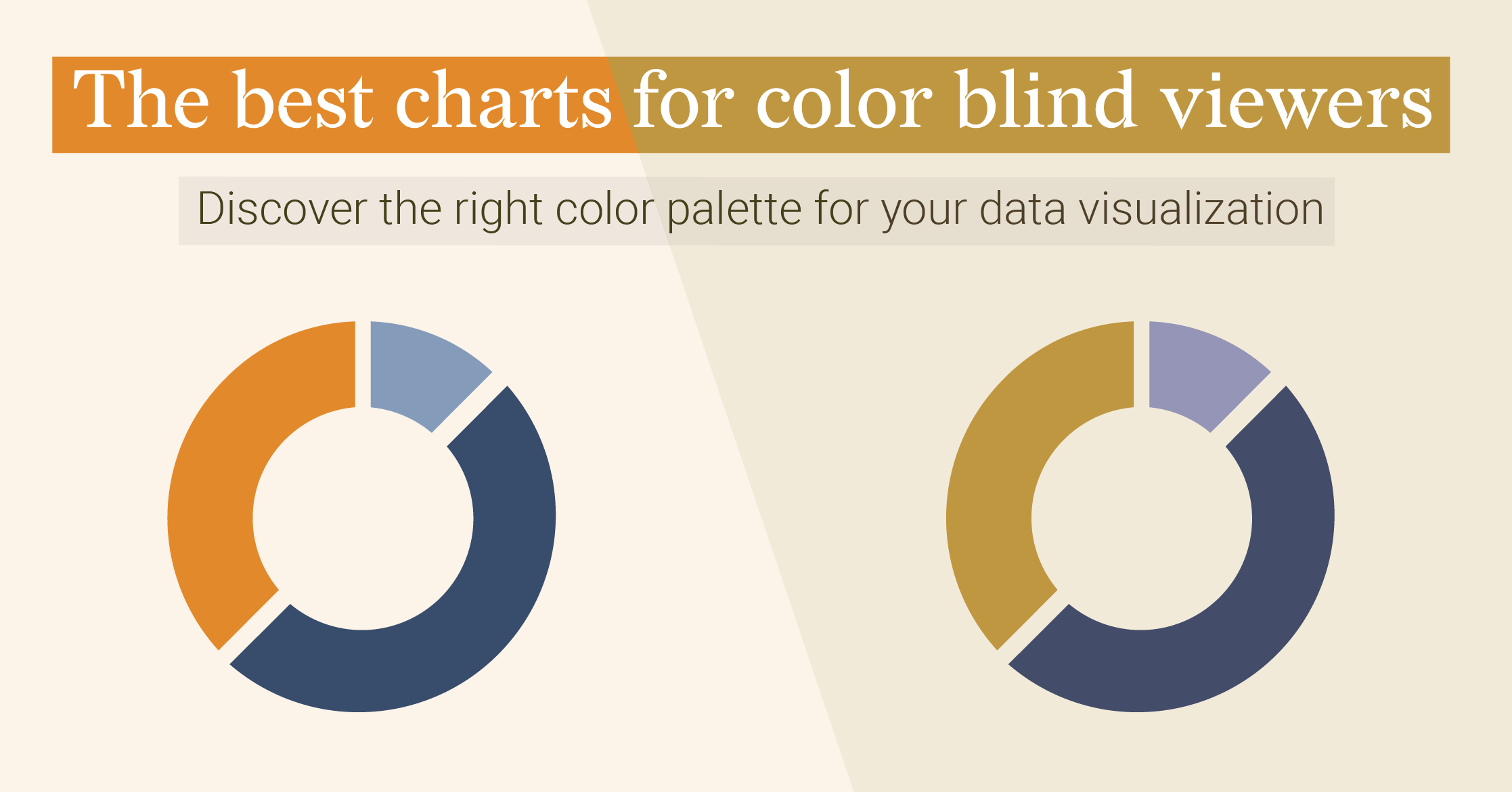
The best charts for color blind viewers
How do we see the world in colors? It all starts with the...
Dataviz Resources
9 types of data visualization
When somebody asks me about my profession and I tell them that I’m a data visualization designer,...
