
DataViz Best Practices, Dataviz Resources, Chart Design, Chart Types
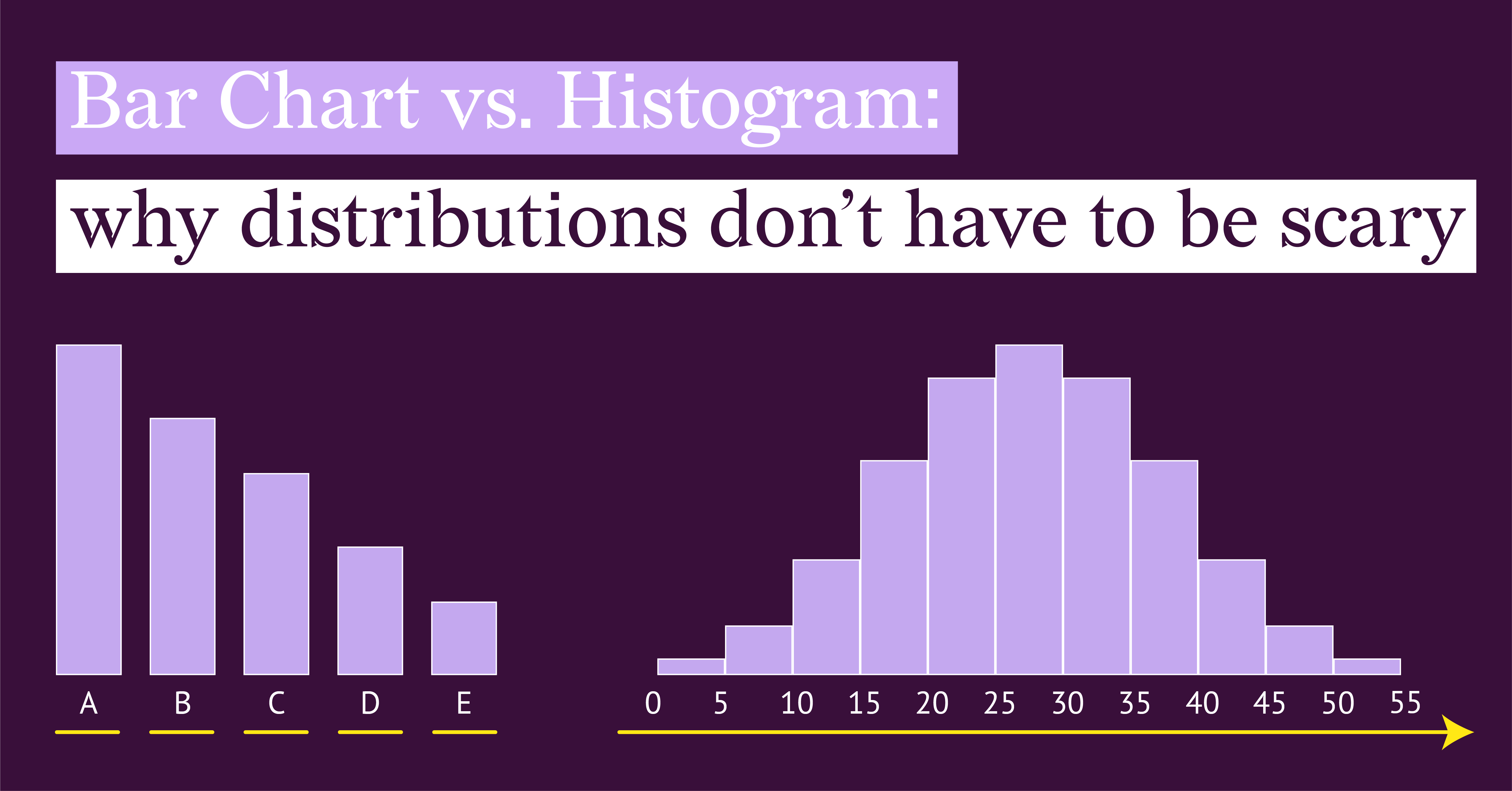
Bar Chart vs. Histogram: Why Distributions Don't Have to Be Scary
Histograms and bar charts look almost identical. If you have ever stared at your data trying to...
Dataviz Resources
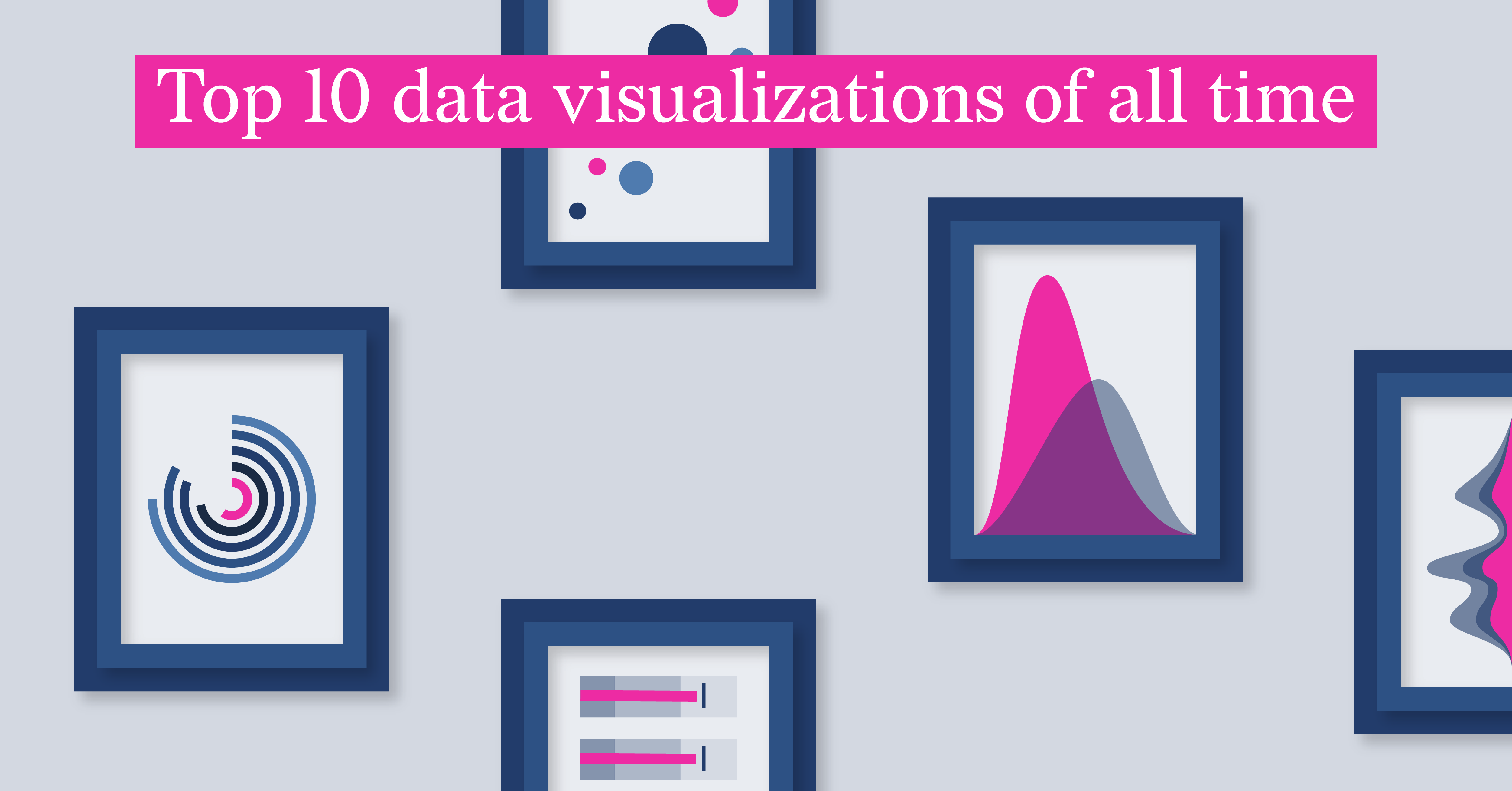
Top 10 data visualizations of all time
You know that spark when a chart tells you more than words ever could? I’ve gathered ten standout...
Subscribe to our newsletter
Receive inspiration, practical advice, customer stories and news right in your mailbox

Report Design, Food For Thought, ESG Reporting
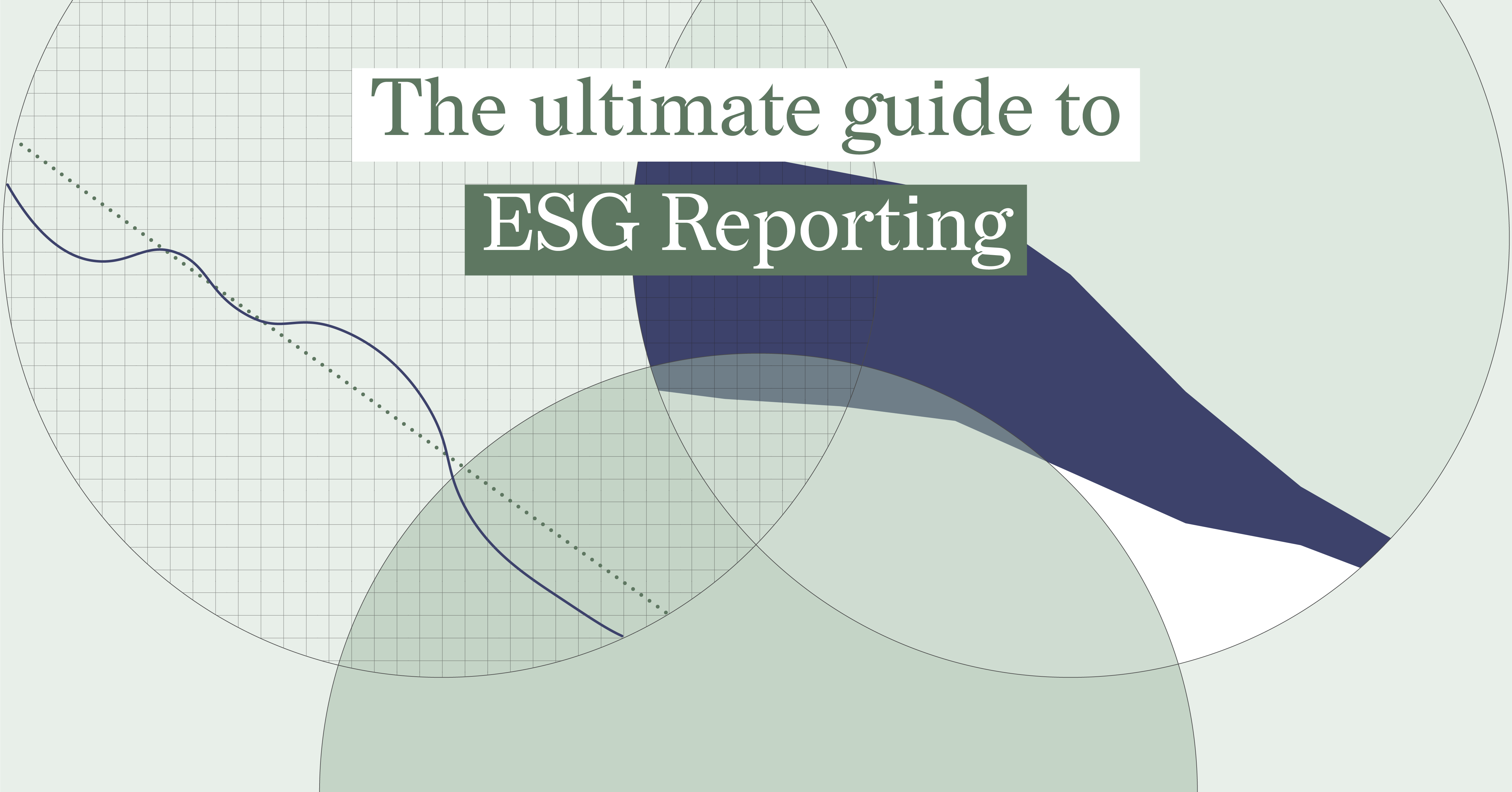
The Ultimate Guide to ESG Reporting
You may agree that environmental, social, and governance (ESG) reporting can feel complicated. You...
/datylon-blog-Clear-Compelling-Compliant-%20How-to-Present-Long-Term-Sustainability-Goals-in-CSRD-Reporting-featured-image-2.png)
DataViz Best Practices, Dataviz Resources, ESG Reporting
CSRD Reporting: Visualizing Long-Term Corporate Sustainability Targets (with examples from practice)
In this blog, we’ll explore the best ways to visualize long-term sustainability goals in CSRD...
DataViz Best Practices, Dataviz Resources, ESG Reporting
The Ultimate Double Materiality Chart
In Part 2 of this educational guide, we identified key best practices for designing an effective...
DataViz Best Practices, Dataviz Resources, ESG Reporting
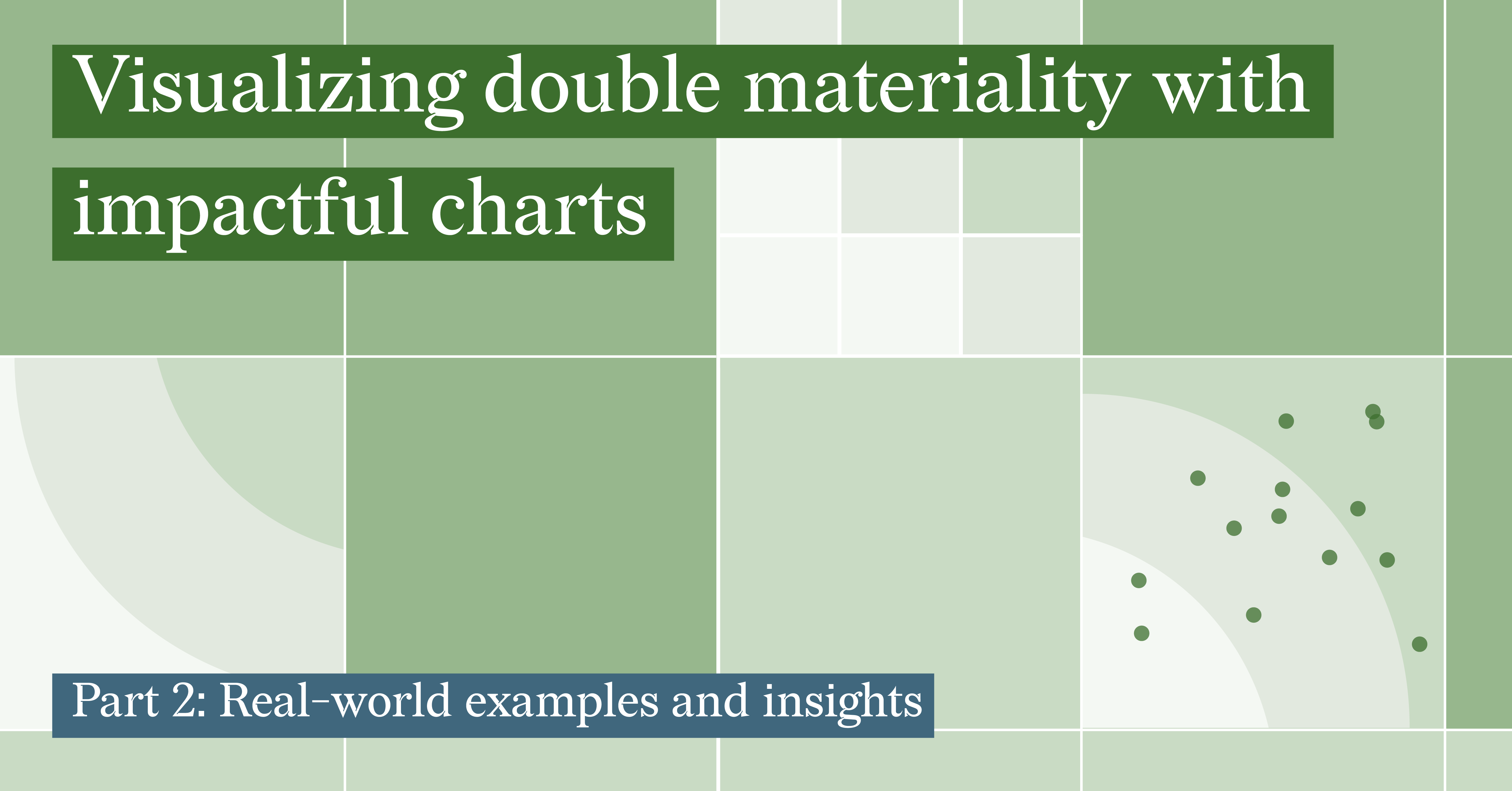
Real-world Double Materiality Chart Examples
DataViz Best Practices, Dataviz Resources, ESG Reporting
Understanding Double Materiality with Impactful Charts
Report Design, Dataviz Resources, Report Server, Automated Reporting
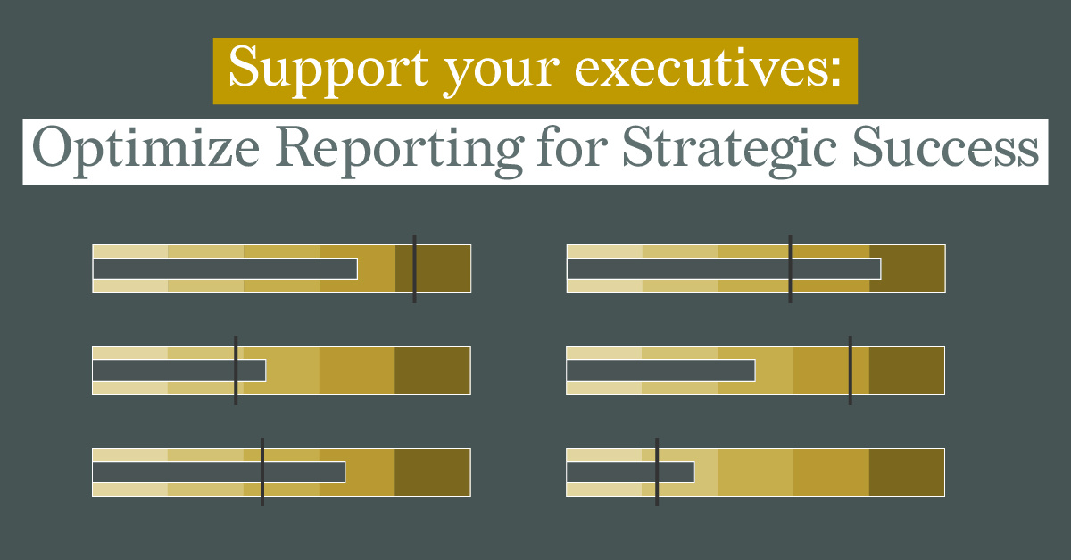
Support Your Executives: Optimize Reporting for Strategic Success
Executive reports are crucial for supporting decision-makers to quickly understand the most...
DataViz Best Practices, Report Design, Food For Thought, Reporting
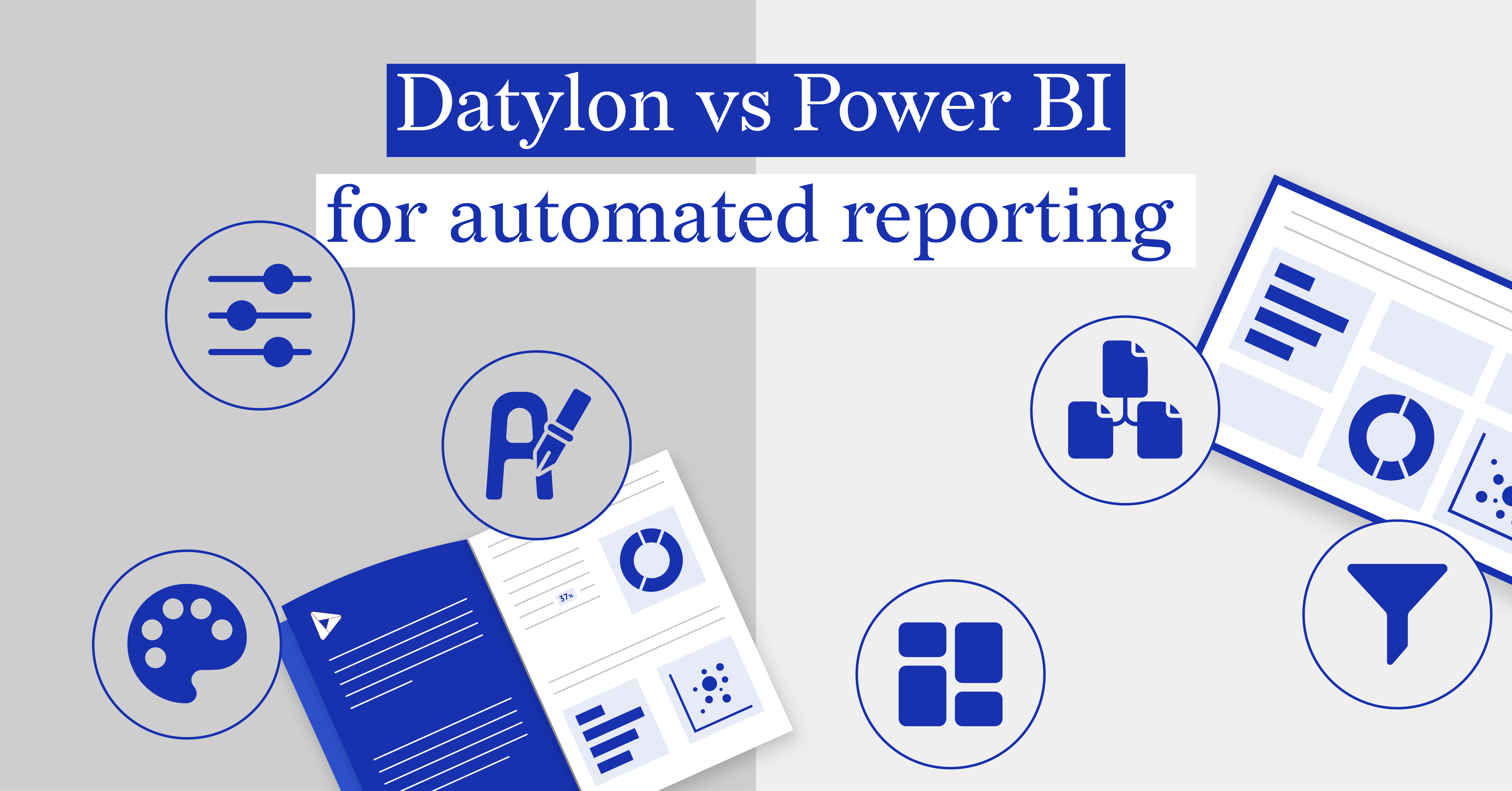
Datylon vs Power BI for automated reporting
In the dynamic landscape of business intelligence, Datylon and Power BI stand out as premier tools...
Product, Report Server, Reporting, Automated Reporting
Climbing the Ladder of Automated Reporting Solutions with Datylon
The arrival of report season can feel like encountering kryptonite for many office workers. Hours...