
Illustrator Chalk Talk
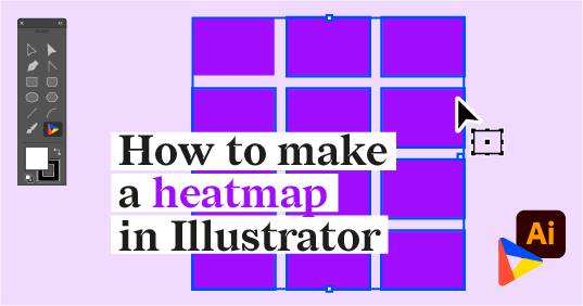
How to make a heatmap in Illustrator with Datylon
Lately, we’ve been writing a lot on heatmaps: how they work, how you should use them, and what to...
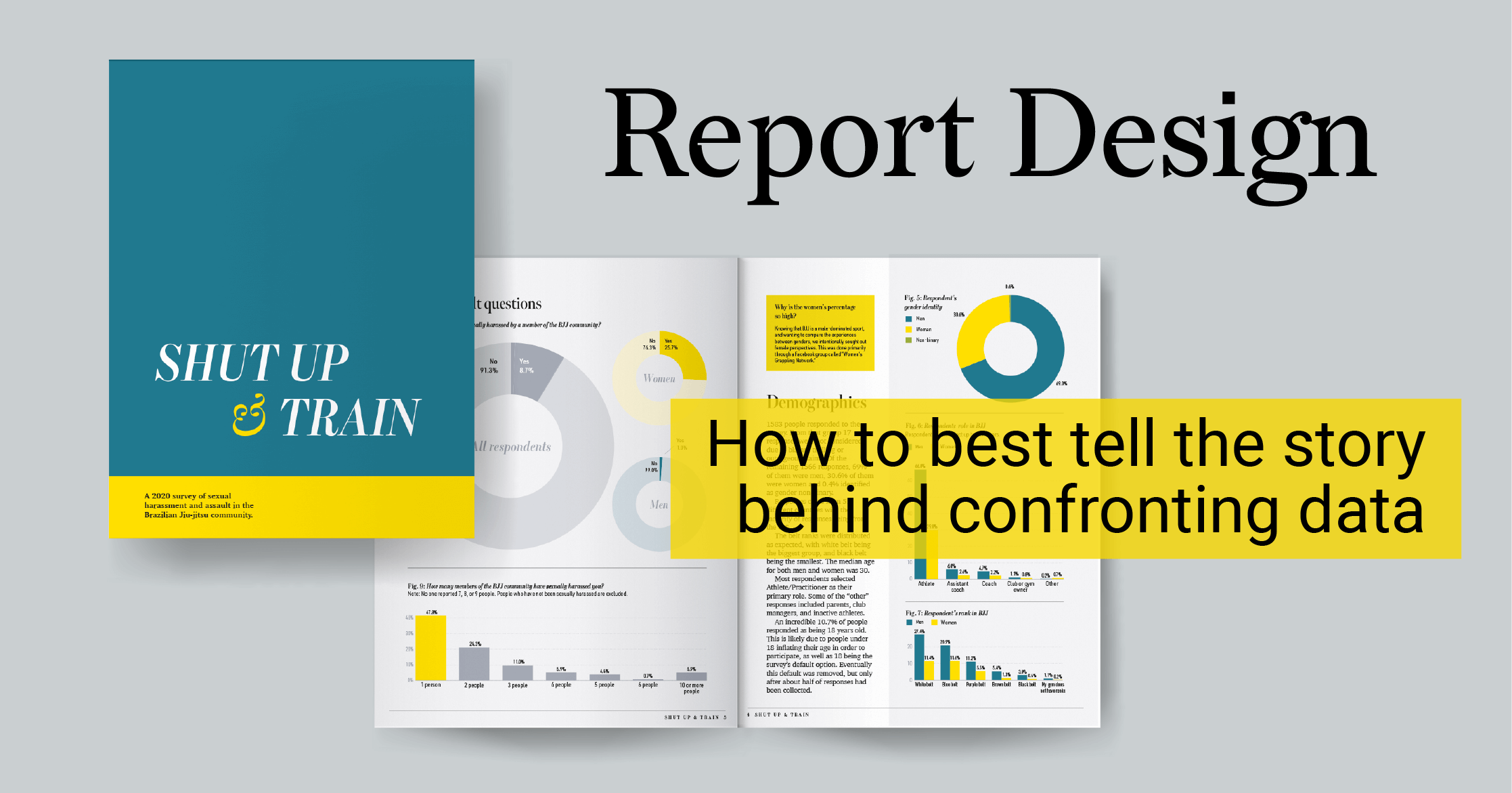
Reporting
How to best tell the story behind confronting data
When you find the time and have the skills, setting up your own data visualization project is one...
Subscribe to our newsletter
Receive inspiration, practical advice, customer stories and news right in your mailbox

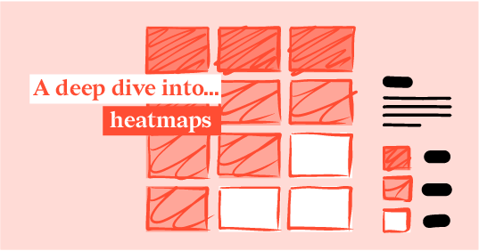
DataViz Best Practices
A deep dive into... heatmaps
Chart types can sometimes be summarized into one iconic example. Think about the global warming...
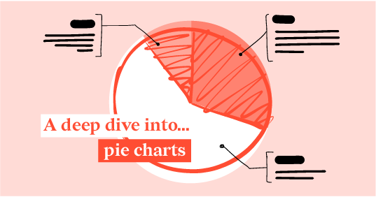
DataViz Best Practices
A deep dive into... pie charts
I have often said that pie charts are the Comic Sans of data communication, but over the last few...
DataViz Best Practices
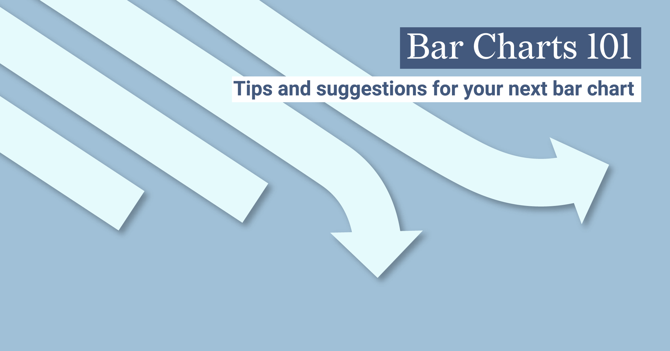
Bar Charts 101 - Tips and suggestions for your next bar chart.
Simple on the surface, the faithful bar chart is often one of the first introductions we get to...
Food For Thought
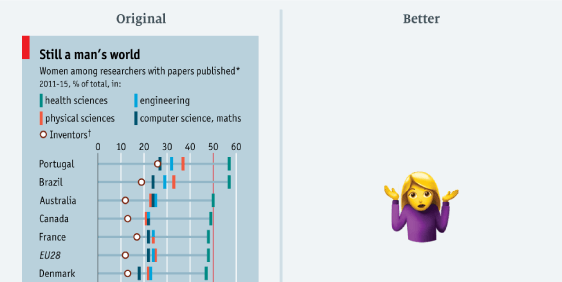
G-E-N-D-E-R I-N-E-Q-U-A-L-I-T-Y, find out what it means to me
To recap: Sarah Leo, Visual Data Journalist at The Economist, wrote a great article on how even...
DataViz Best Practices
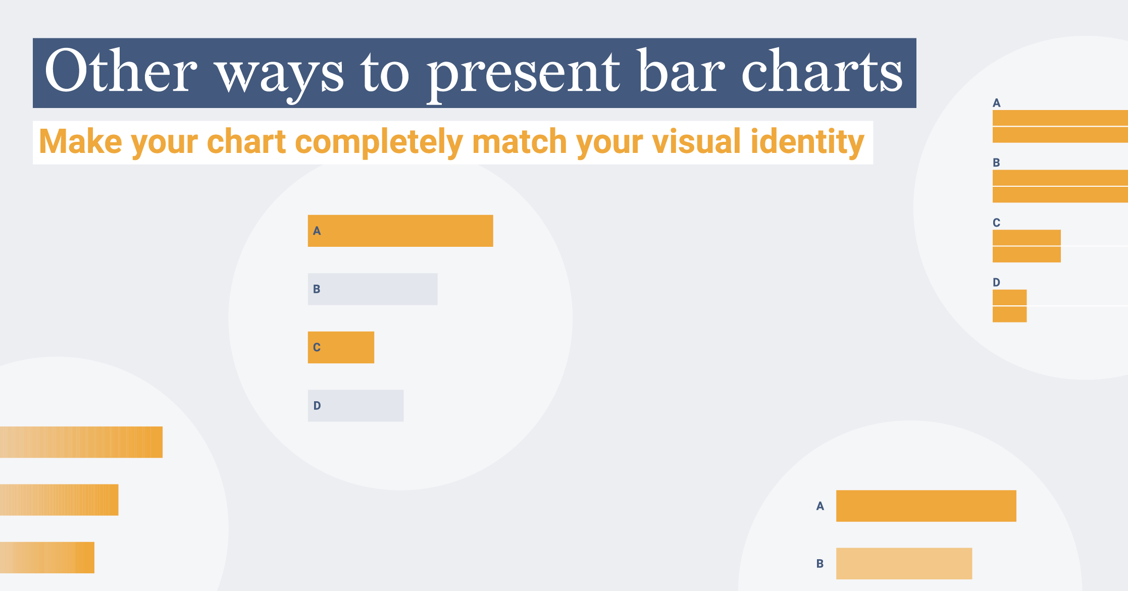
Other ways to present bar charts
We all love readingAndy’s blog postshere at Datylon. In thelatest one, we even felt a bit...